Luxury of Depth
A Take on Luxury in an Era of Modern Process Accessibility
By Vaughan Lewis Carman
What is LUXURY to you?
1. Time __________________________________ Detail
2. Purpose _______________________________ Function
3. Intellect _______________________________ Explanation
All under the curation of affordance.
impact / joy > immediacy
With this new age of iteration, we have newfound opportunity to push conceptual design through the realms of abstraction, and depth to house storied perspectives, create personal connection and pose new questions. When I first applied to work for Ecco Leather back in 2020, I was asked, “What is luxury to you?”. At the time, I compiled a list of terms that to me felt like the purest form of luxury, solely by my definition.
To me, at its core, luxury is founded on a balance of self-defined, high quality and self-made limited access. When I think about what I thought luxury was as a child, I was more enthralled with my relationship to luxury was, rather than the object or experience being the luxury. It was self-defined luxury based around joy that I felt, not how others defined it, or how it would grow in value over time. This also made me think that luxury and wealth are further apart than I expected, similar to how I view affordability and affordance.
Affordability:
- The ability to be afforded
- The cost or price of something
- The relationship between cost and what the consumer is able to pay
Affordance:
- What the environment offers the individual
- What a user can do with an object based on the user’s capabilities
Affordability – object – user outcome – (yes, can afford) or (no, cannot afford)
Affordance – object – various user outcomes
I find this relation similar to how I would interpret the difference between wealth and luxury.
Wealth:
- An abundance of valuable possessions or money
- A plentiful supply of a particular desirable thing
- An abundance of valuable financial assets or physical possessions which can be converted into a form that can be used for transactions
Luxury:
- A state of great comfort or elegance, especially when involving great expense
- A condition of abundance or great ease and comfort; a sumptuous environment
- An indulgence in something that provides pleasure, satisfaction or ease
Wealth – abundance in a transactional / financial way – monetary
Luxury – abundance in the form of ease, comfort, or elegance – state / environment
As with affordability vs affordance, wealth is focused around the singular user outcome of monetization, while luxury can host various user outcomes based around multiple interpretations. This is why, I deem luxury of more value than wealth as there are more opportunities to create your own definitions within luxury. This goes back to the creation of our own definitions. At the moment, I, personally, have broken down luxury into key 3 components, as I was originally instructed. What I have developed since constructing these original components, is pairing each of the 3 components with its own core reasonings.
The 3 Core Components of Luxury + Their Applicable Core Reasonings:
Time _________________________________________ Detail
Purpose_______________________________________ Function
Intellect_______________________________________ Explanation
In their most core definitions, the pairings are meant to act as workable inverts of one another, each pairing relating to luxury as back and forth duality. Liken a proper tennis rally, each side provides energy to create a captivating point. Luxury has this assumed level of quality that comes built into the definition. Even just looking at the definition I selected to include in this writing out of the various options and defined interpretations from dictionary sources, the definition of luxury still maintains this focus around the concept of development.
One of the definitions I came across for “luxury” was as follows: - A state of great comfort or elegance, especially involving great expense.
“… great comfort or elegance, especially when involving great expense”. Now if we look at this definition and break it down into parts, we get these interesting layers within the definition itself. We see “great comfort and elegance” but also, we see “great comfort and elegance when involving great expense”. Expense is usually relayed back to a foundation of financial means, but we can also translate “great expense” to be defined as a value of time. The time it takes to gather materials. The time it takes to design a final result. The time it takes to produce a finish product. All these moments in the process take time, or “great expense”. Through these defined channels of luxury and time, we see our own definitions of luxury start to take form. In this instance, it is clear that time is the equivalent to define luxury, seen through the traditional steps of making a final product. I appreciate the the viewpoint of time as luxury, especially how we can look at time in different ways through luxury. Not only through the process of the creation of the product itself but the time of the individual or individuals involved. The time needed to gather the information, the skillset, the ability to know how to create. People build their craft through schooling or experience, all of which take time. This is why though the first of the three core components of luxury I have paired time with detail.
One of the definitions I came across for “detail” was as follows: - An individual fact or item.
An individual detail is unique to itself, and only itself. But multiple details, varying details, take time, effort and patience. This is the luxury, the time and the use of details: a bigger picture, formed by smaller components. To me, this is how the formula would look.
Detail Detail Detail
Detail Detail
_________________ = Luxury ----- Translation: Multiple details over time is luxury
Time
To better display this formula, let us look at the concept of an atelier.
An atelier can be defined as “a private workshop or studio of a professional artist in the fine or decorative arts, or an architect, where a principal master and a number of assistants, students, and apprentices can work together producing fine art or visual art released under the master’s name or supervision.
*let the record show that ateliers were the standard vocational practice for European artists from the Middle Ages to the 19th century.
*bottega – the studio of a master artist, in which lesser artists, apprentices or students learn by participating in the work (Italian origin), (hence bottega veneta just being atelier veneta)
The terminology around the term “atelier” has changed drastically since it’s origin. In the 2019 video / article by Complex Magazine, Joe La Puma links with Human Made founder and cultural polymath Nigo, to visit his Toyko, Japan based “atelier”. In the beginning of the video, Complex displays the definition of an atelier as “a private workshop or studio typically used by a professional artist or designer”. La Puma is then given a personal tour of the massive space, previously unseen to the public. The pair begin to comb through Nigo’s personal collection of clothing, figurines, shoes, design objects and more. The number of objects in total can be assumed to surpass the hundreds, just by pure visual assessment alone. Personally, I wouldn’t consider this an atelier, more of a personal collection / archive. The vault acts as a reference point, highlighting various aspects defined by Nigo and by society. Regardless, the objects in this space, the culmination still confirms the first core component and formula of luxury. Nigo culminating a bevy of coveted pieces over the years afforded him his collection, which in this case is the luxury. One could also say that since the collection is made up of luxury items, that Nigo is able to maintain the luxury of luxuries, and this collection in particular speaks volumes.
Base Formula: *Nigo* Formula
Details Collection / Accumulation
_________ = Luxury ______________ = Luxury
Time Duration
Comparison: Luxury as Time; Luxury as Detail // Conclusion: Luxury is not rushed
Design is defined as “a plan or drawing produced to show the look and function or workings of a building, garment or other object before it is made”. In comparison to this, art is defined as “the expression or application of human creative skill and imagination, typically in a visual for such as painting or sculpture, producing works to be appreciated primarily for their beauty or emotional power”. These definitions highlight the separation of design and art as function in the physical usefulness of the completed work. Art is to be appreciated; design is to be used. Currently there is a push for art as design and design as art. We see the adoption of mass manufacturing becoming more present within the art world, as well as designed objects being presented in a more showcase like environment. Similar to how your grandma may have a couch wrapped up in plastic, or how dining rooms are primarily untouched throughout the year, except for special occasions. These examples bring me to the second formula of luxury.
Base Formula:
Purpose
__________ = Luxury
Function
Luxury has always been this elevated presence of familiarity. A well know object remixed with finer materials, higher production quality, and of course, marketed by the most primed stars of the current moment. But there’s categories and ranges to luxury. In our modern era, let’s compare three modern luxury brands of three different spaces of luxury. Christopher Raeburn, Cactus Plant Flea Market, and Louis Vuitton. Each offers a different interpretation of luxury as well as a varying usage of the formula above.
Christopher Raeburn: “Raeburn is a collaborative, creative fashion studio where daily design meets responsible production, alongside monthly events, discussions, and workshops.”
Brand Description: “Christopher Raeburn has established his eponymous brand with responsible and intelligent fashion design for a global audience. The Raemade ethos in particular has pioneered the reworking of surplus fabrics and garments to create distinctive and functional pieces. Alongside this, a highly collaborative spirit informs luxurious handicraft, and award-winning products with integrity and purpose. This innovative approach, with an unusual balance of high-concept, accessibility, and wearability is applied to menswear, womenswear, luggage and accessories. With its Raeburn Labs in the heart of East London, Raeburn is stocked in the best stores globally, and receives media coverage worldwide. Christopher won a Fashion Award in 2020, selected as one of the honorees of the environmental category. The awards celebrate the individuals who have created positive change within the fashion industry, as chosen by 800 key members of the global fashion industry.”
Raebrun exemplifies a conscious, modern take on luxury clear purpose / intent. With upcycling and conscious sourcing being a clear focal point of the brand, Raeburn and his team craft ready-to-wear garments that showcase a field day of patterning knowledge. By pairing upcycled fabrics with elite design workings, Raeburn transports otherwise sedentary fabrics into uncharted silhouettes for the material. This method of making focuses on functionality in various ways: The function of material, the function of the designer, and the function of the garment, ultimately resulting in the formation of luxury, thus fitting the formula.
Base Formula: *Raeburn* Formula
Purpose Conscious Design
_________ = Luxury ______________ = Luxury
Function Rejuvenated Product
Next, we have Cactus Plant Flea Market (CPFM). Founded by Cynthia Lu, Cactus Plant Flea Market feels very special to me. It makes me wonder about not just luxury, but the future of localized making. (CPFM) is a curious case. There is little information about the background of the brand and its founder. Though I was unable to find much in relation to interviews that Lu has given in relation to the brand, it feels refreshing to me, because by doing so, she has let the work speak for itself and for her as well. The website design also confirms these feelings. As of my writing currently (March 13th, 2023), the homepage houses all available garments, with the least expensive being $40 (CPFM) Logo Socks, and the most expensive being the $1,680 Suede Knowledge Jacket. The garments boast bold colors in various silhouettes, but what makes me really enveloped in this brand relates to the only article I could find on CPFM and Cynthia Lu, a July 2020 GQ article titled, “The Mysterious Mind Garden of Cactus Plant Flea Market”. The articles highlight Lu as a dedicated, hard-working elusive, who prior to collabs with Denim Tears, Nike, Comme De Garcons, Stussy and more, was working P.R for Billionaire Boys Club, later selected by Pharrell Williams to be his personal assistant and ultimately, his personal stylist. If it couldn’t get any more interesting, the interview describes Lu is made of excerpts from Pharrell Williams, Virgil Abloh, and Nigo. The storyline feels like the stuff of legends, and within the interview, the compare Lu’s exclusivity of personal privacy to that of Margiela. This is an aspect of luxury that Lu creates herself that is ultimately rare. The formation of the incognito designer, making access to understanding her thought process, other than through the objects she designs and create a true luxury (She hand makes all her prototypes, I highly recommend this GQ article). In this case, Lu exemplifies a form of luxury that goes against the tide of mass product categories, and mass production methods.
Base Formula: *Cynthia Lu* Formula
Purpose Individuality
_________ = Luxury ______________ = Luxury
Function Controlled Pace
Not only by making what she wants, when she wants does Cynthia Lu control the demand, but she pushes the exact things she wants to produce. She is the factory, she is the developer, she is the customer service rep. None of this is easy, but the way Lu goes about her process makes it naturally a luxury. The removal of additional variables, waiting periods, and sign offs allows her to achieve the purest form of making, a true luxury in today crowded design world.
Finally, we have Louis Vuitton. Before we disucss Louis Vuitton the brand, we must first understand Louis Vuitton, the person. At age 16, Vuitton movd to Paris to apprentice as a box maker and packer. Vuitton would work for 17 straight years, before ultimately leaving to open his own workshop. He later expanded his operations through the formation of the Asniéres Workshop, the company’s studio which was also located at the family residence. This combination of work life and home life intertwined arguably only works in a founder’s setting and support. The dedication Vuitton and his family displayed through their work was both impressive and intense. Though the concept of a “home studio” is common in our modern era, the concept of a “home factory” is unheard of. Another aspect of unheard-of practices Vuitton executed well was the creation of design team and a production team of artisans, which allowed for more rapid growth and development. George Vuitton (son of Louis Vuitton) for example, was pinnacle in the development of luggage locks as well as luggage closure systems for the brand. What started in 1854 as a luxury trunk brand, has since evolved itself into an international symbol of status. The brand had all the potential and authority to remain within the realm of luxury luggage, but instead chose to brave new paths and expand, highlighting new routes of innovative practices. An example of this would be the release of the Louis Vuitton Keepall Bag in 1930, which was a lighter alternative for travel luggage in comparison to their travel trunks. By expanding the direction of their product, they were able to teach themselves how to pivot between markets rather than learn solely form competitors. These actions showcase Louis Vuitton’s formula through a view of personal growth and expansion. A combination of product development, and innovation funded by luxury consumers led to the brand pushing into new territories in the modern age such as stationery and streetwear.
Base Formula: *Louis Vuitton* Formula
Purpose Status / Quality
_________ = Luxury ______________ = Luxury
Function Constant Innovation
The final aspect of luxury in this 3-part research paper is the relationship between intellect and explanation within the bounds of luxury. Intellect is defined as “the faculty of reasoning and understanding objectively, especially with regard to abstract matters”. Objective reasoning and understanding go hand in hand with explanation, defined as “a reason or justification given for an action or a belief”. I would argue that the main connection between intellect and explanation is process and accreditation.
Process: A series of actions or steps taken in order to achieve a particular end.
Accreditation: The action or process of officially recognizing someone as having a particular status or being qualified to perform a responsibility / particular activity; an acknowledgement of a person’s responsibility for an achievement of something.
Base Formula:
Intellect (Process + Accreditation)
___________________________ = Luxury
Explanation
Having an idea and the means to accomplish said idea is acceptable. Luxury views “acceptable” as not an option. You need to be able to maintain a further showcase of depth. It takes time and dedication. Look at the majority of celebrity or influencer-based endorsements. Most have such minimal knowledge or interest in the product their selling, but consumers are led to believe they are the driving faces of said businesses. There must be true care, true passion, true knowledge of the product and what it means to those who enjoy it to thoroughly understand it as luxury.
Vaughan Lewis Carman
(2024)
Digital Print Leather Research for Hagel
Leather research done in partnership with the footwear design studio, Studio Hagel


Ecco Studio Session(s)
Short lived, but worth-wile, Ecco Studio Sessions was a community engagement series where local, NY-based creatives had the opportunity to present their work through the lense of both Ecco and Ecco leather. Hosted out of the Brooklyn Design Studio, guests were introduced to Ecco footwear and the Ecco Leather world through interactive events and community gatherings.
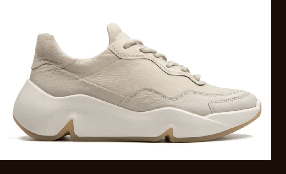
For the first and ultimately only Studio Session, we hosted Furniture Designer, Phil Panza and Painter, Isabella Cura to help highlight the Ecco Offroad Sneaker.
Photography: Matthew Lejune
Sounds: Ian Locke
Special thank you to Cory Zhao, wouldn’t have been possible without your support.


Paolina Russo x Ecco
Reflective leather, masked with a digitally printed rainbow camo for Paolina Russo full leather fit and shoulder bag. Photos via Paolina Russo + Ecco Leather.


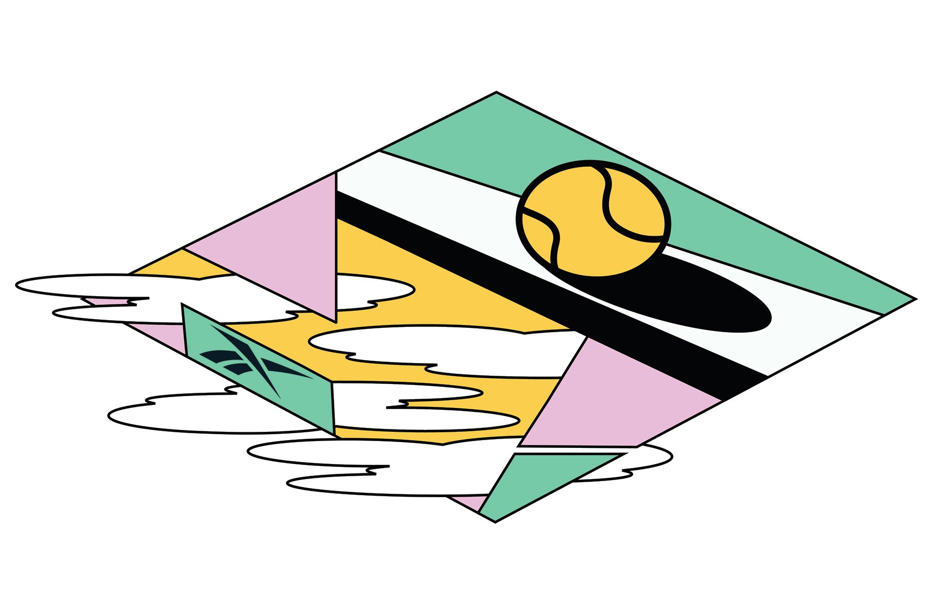
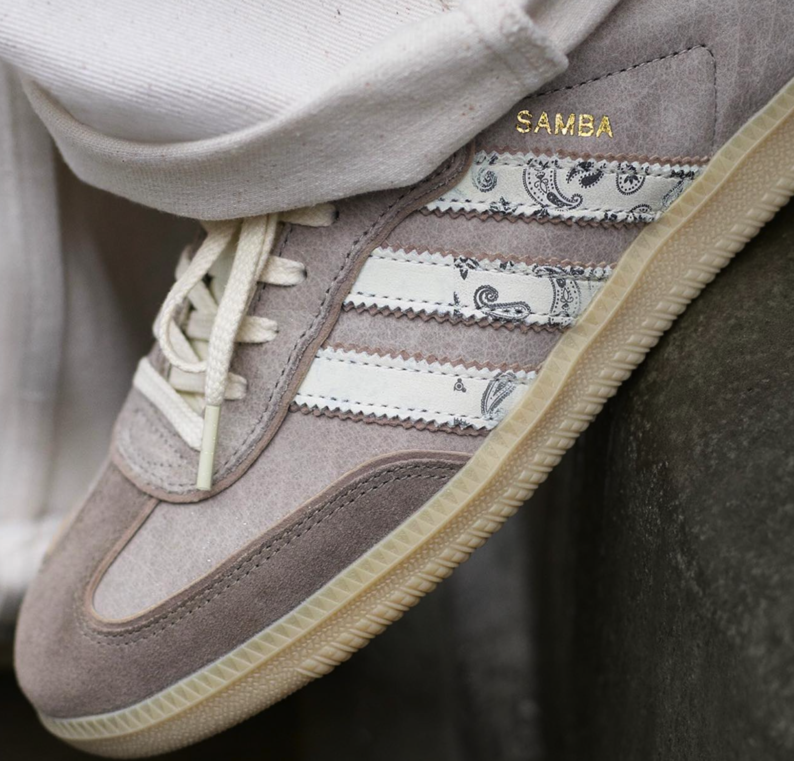
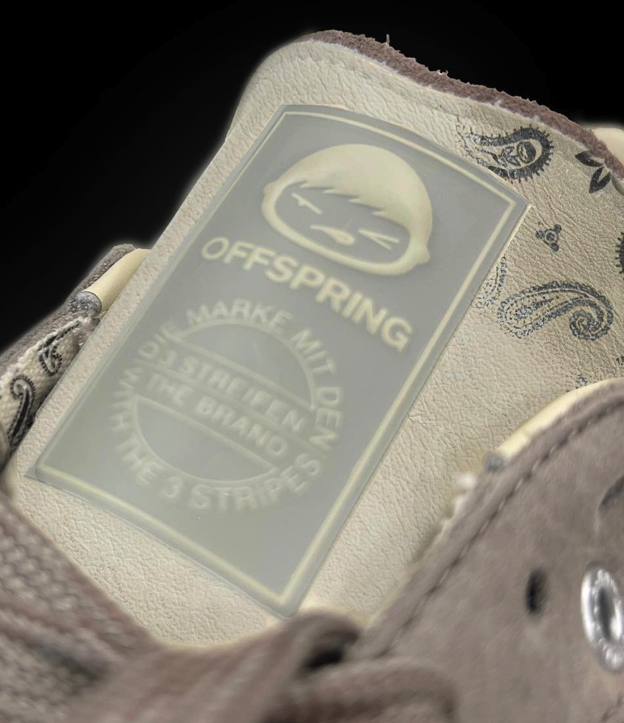
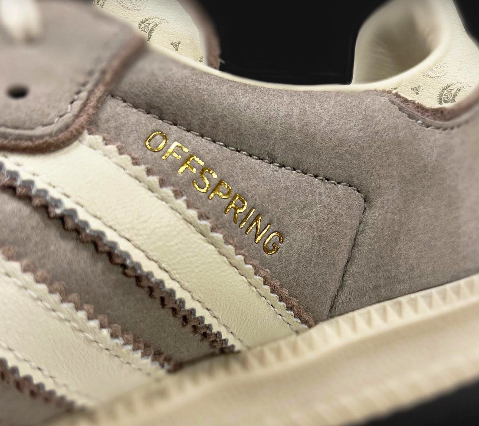
Offspring x Adidas Consortium Cup
Wear-away leather with a paisley digital print underlay used in two of the three models submitted by Offspring for the Adidas Consortium Cup…
…WHICH THEY WON!
Photos via Offspring.


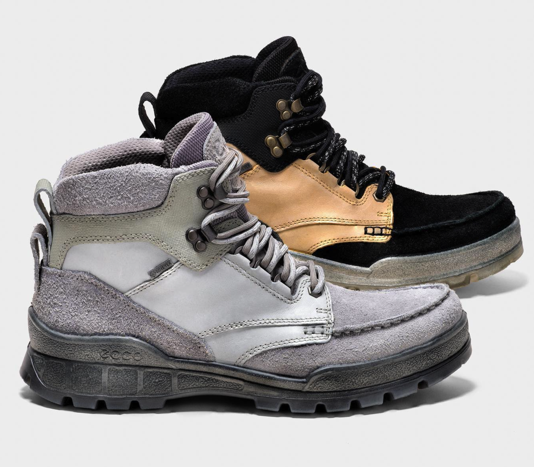
Concepts x Ecco Track 25 High
In collaboration with Concepts, Ecco released limited-edition Track 25 boots, in two Kromatafor temperature-changing colorways. Photos via Concepts.


Leather Floppy Disc Coaster Concept
Leather Floppy Disc made from two pieces of pebble-emboss Bovine leather, fused together. Detailing done with paint pen and finished with clear coat.
Pitched as a potential gift for Hotshop 14 participants.
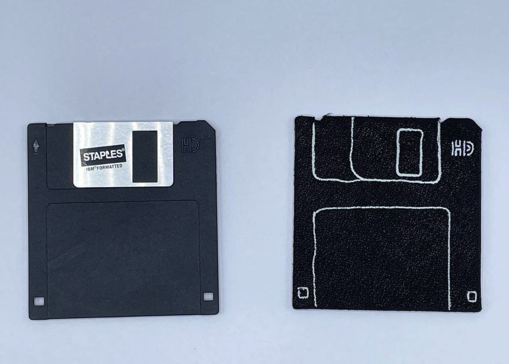
Front view

Back view

Detail shot

Detail shot
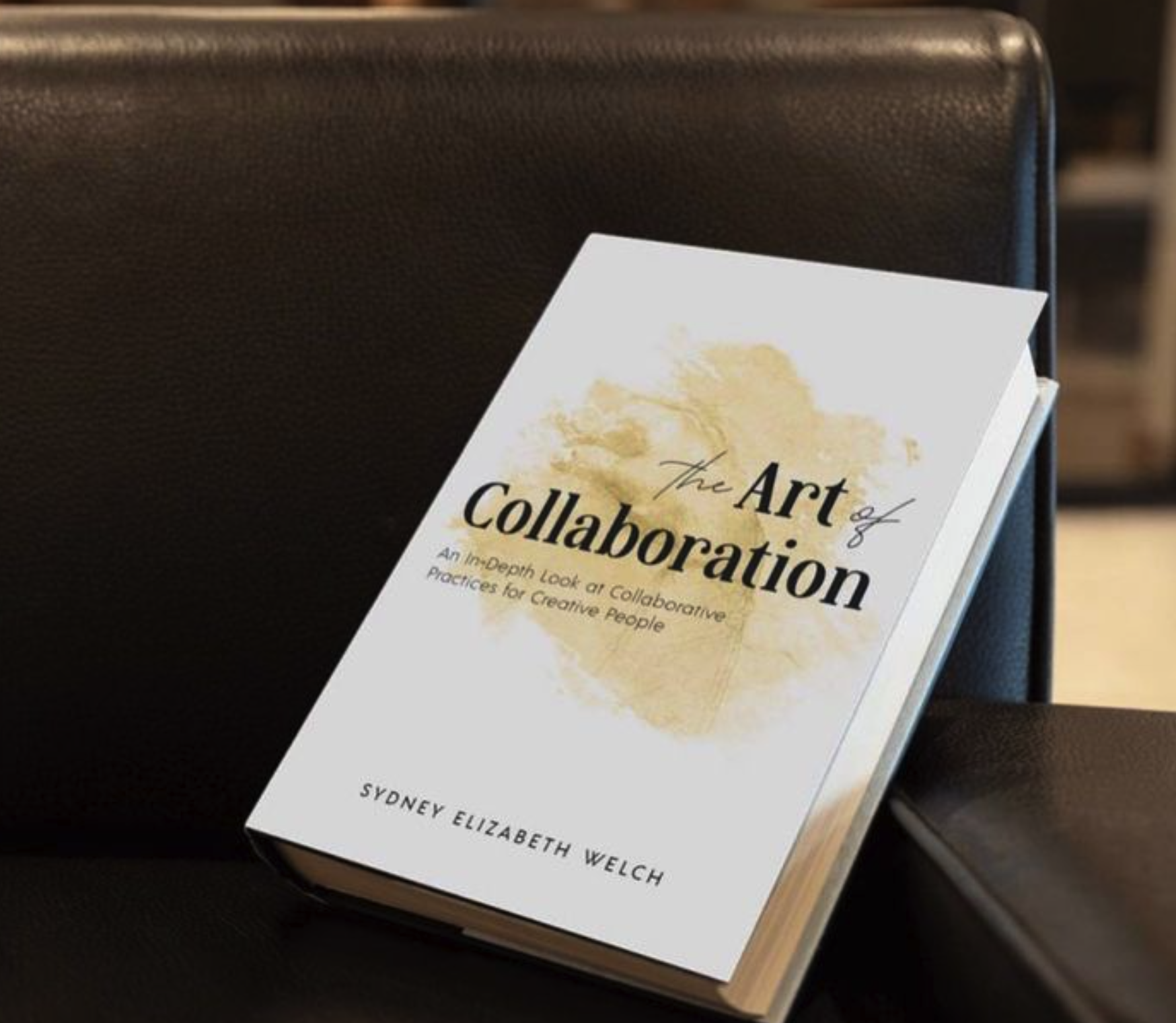
The Art of Collaboration
Contributed a chapter to the book, “The Art of Collaboration”, written by Sydney Elizabeth Welch. In the book, I discuss some of my experiences within the footwear and apparel industries as well as why I like collaboration as a whole, available now.
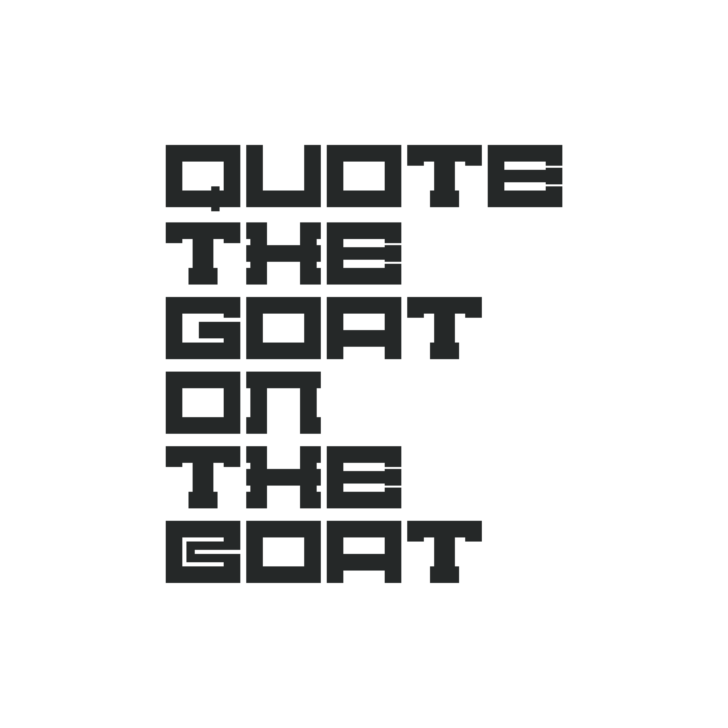
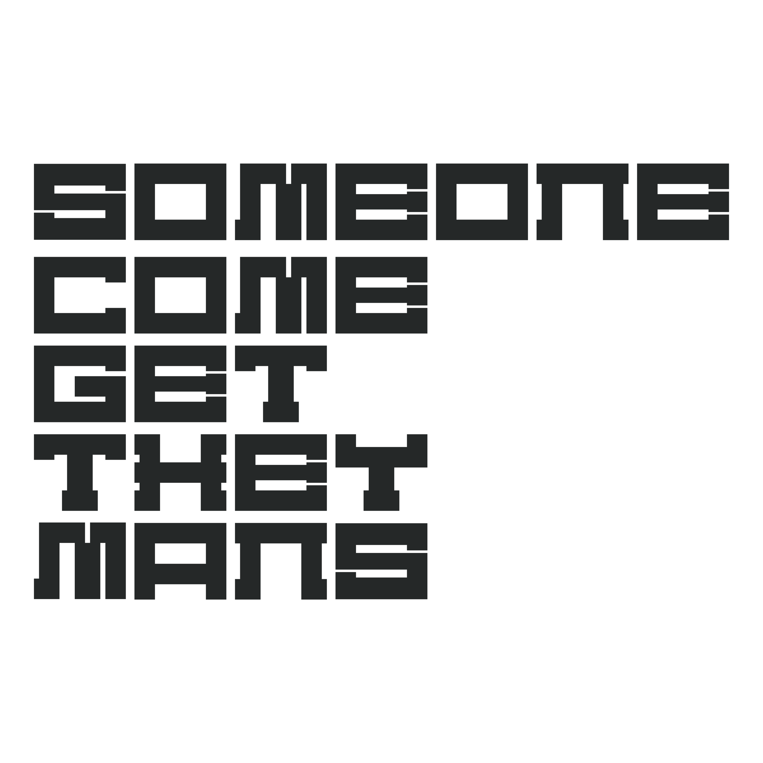
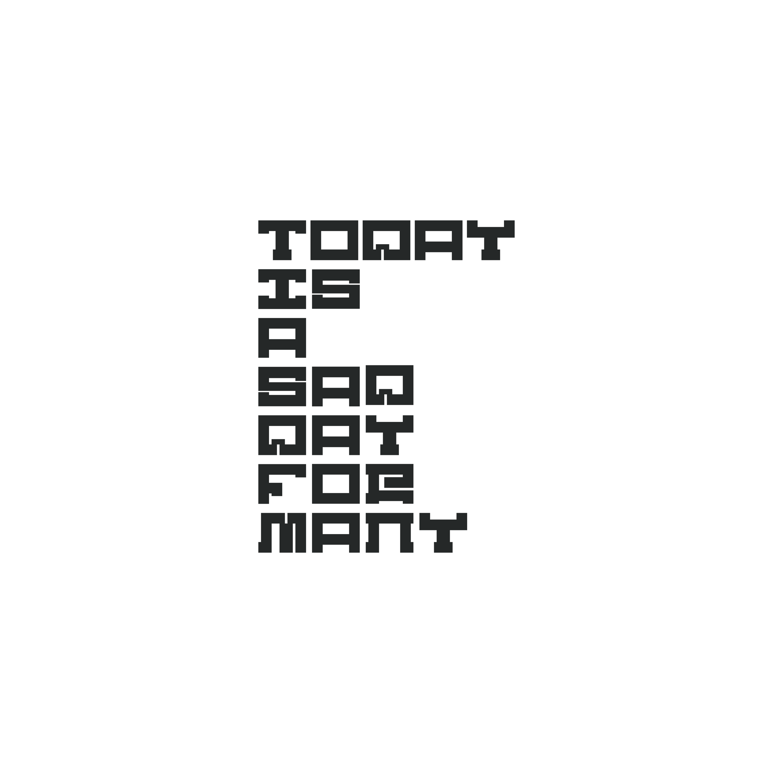
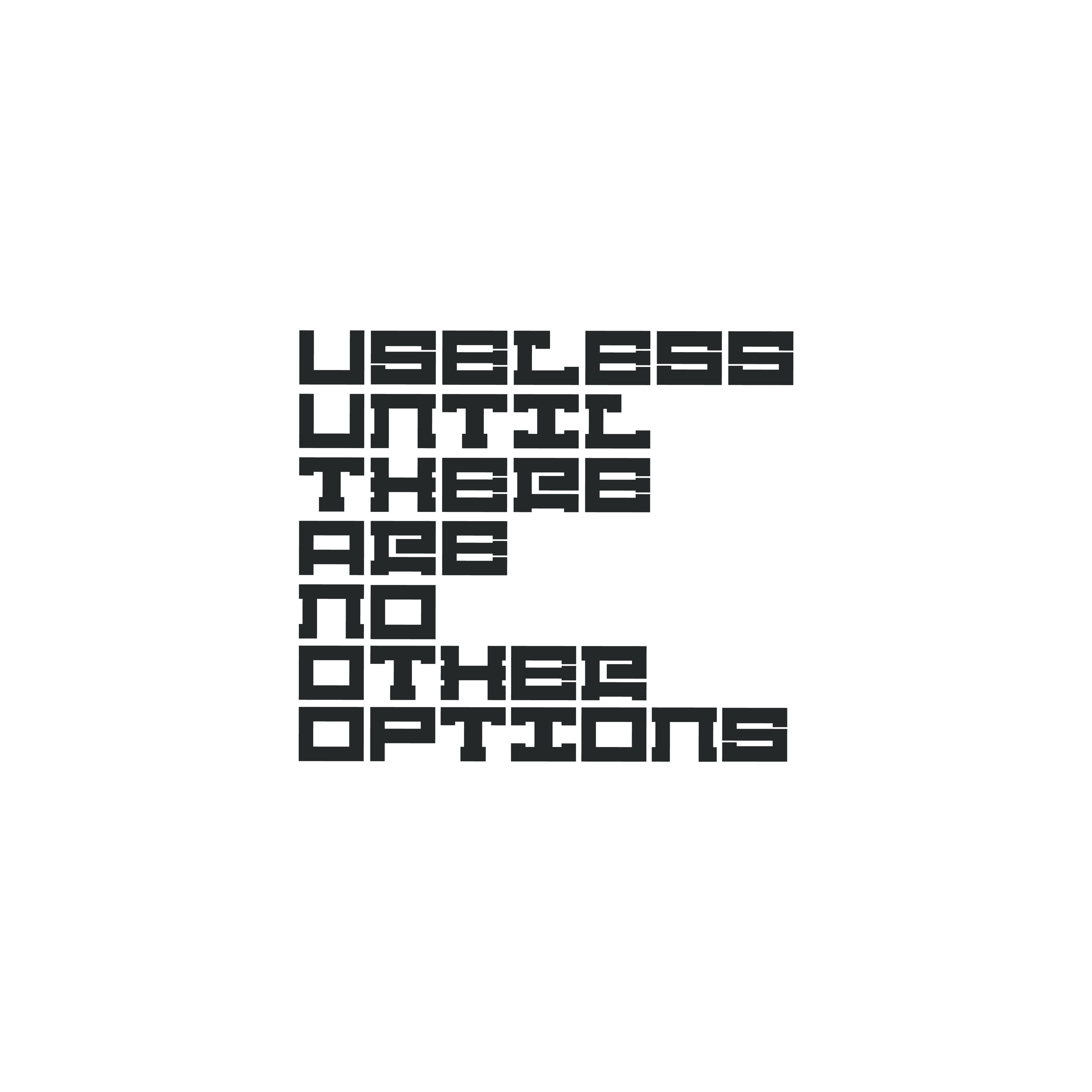
Tandem Offense: The Collective Poetry of Sy Woolstenhulme
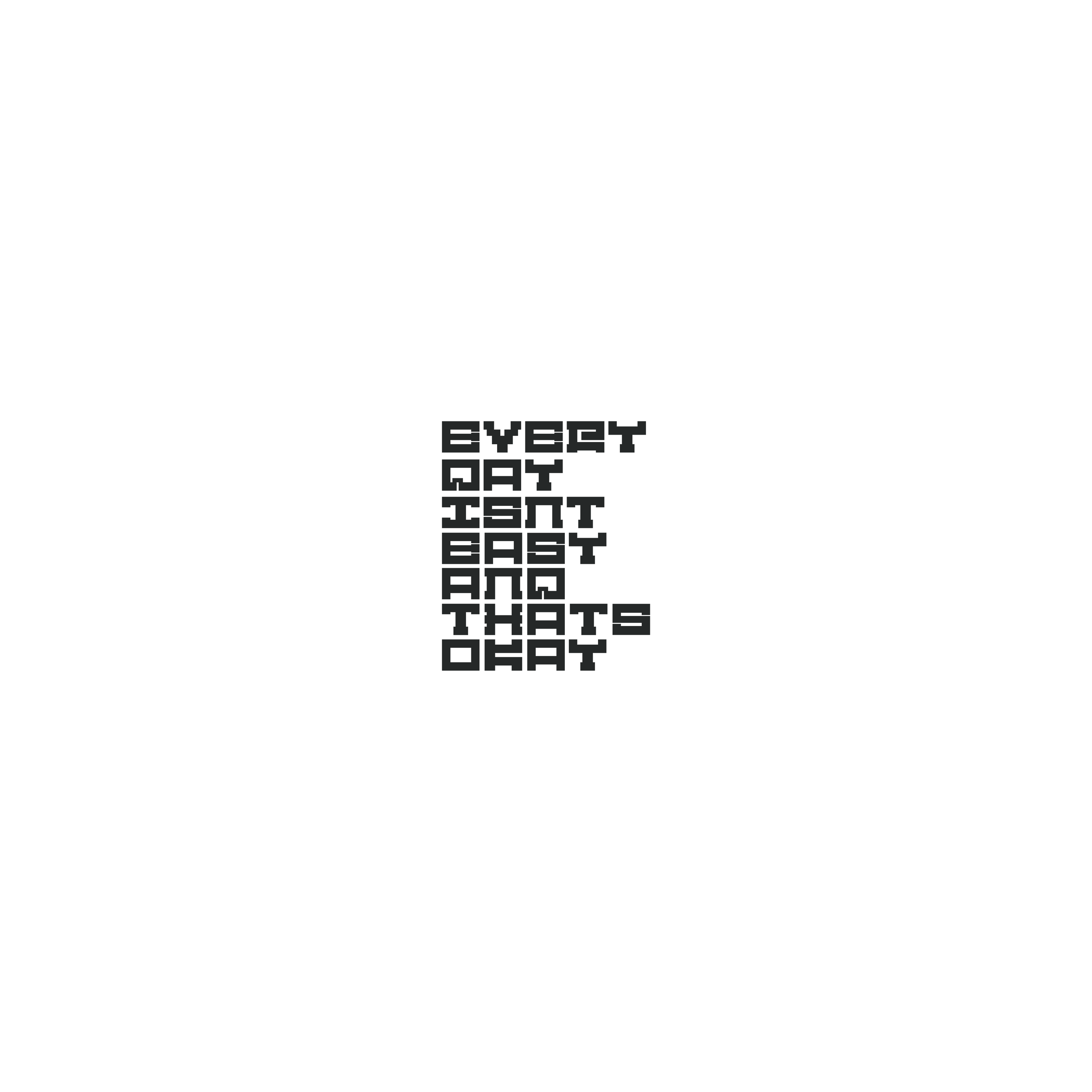
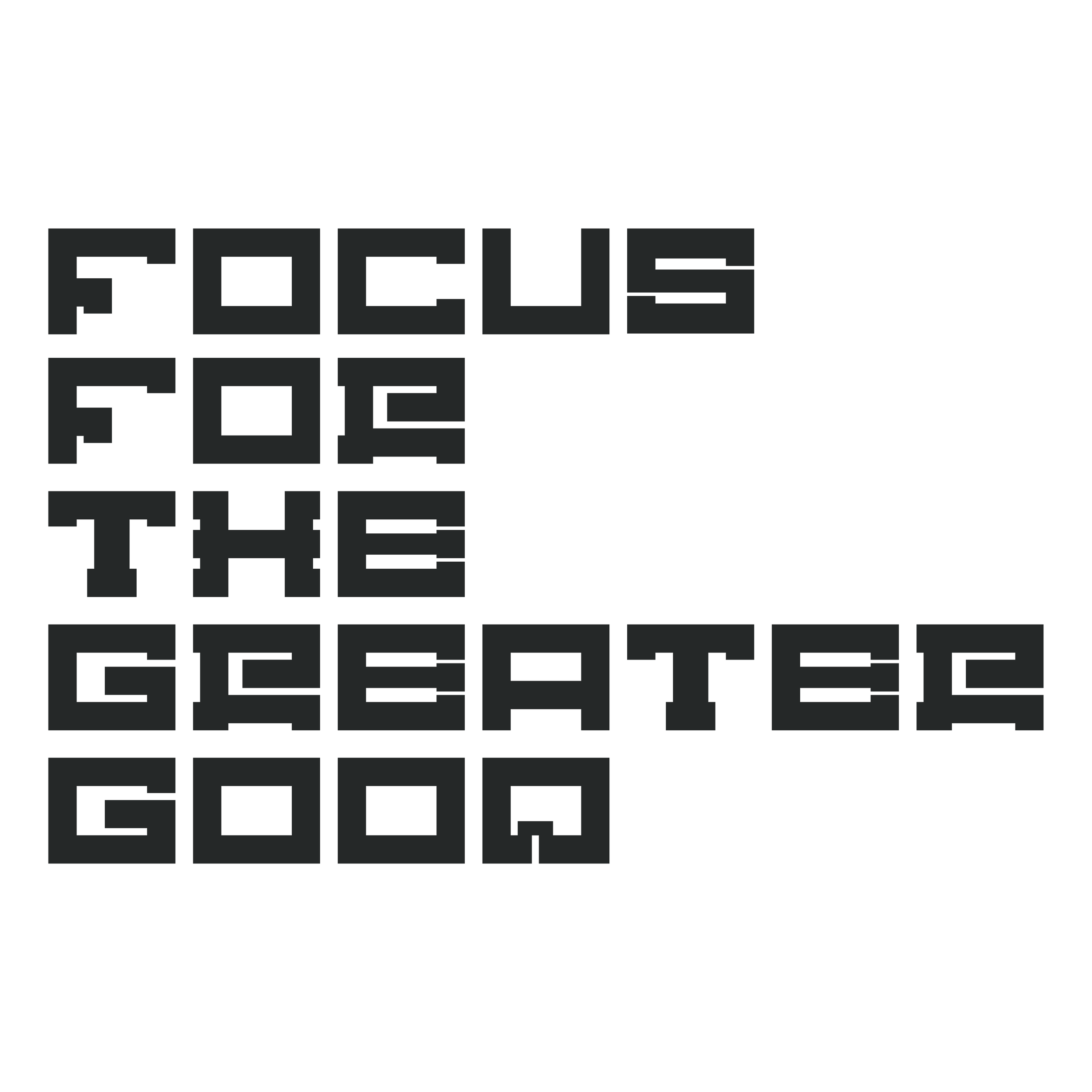
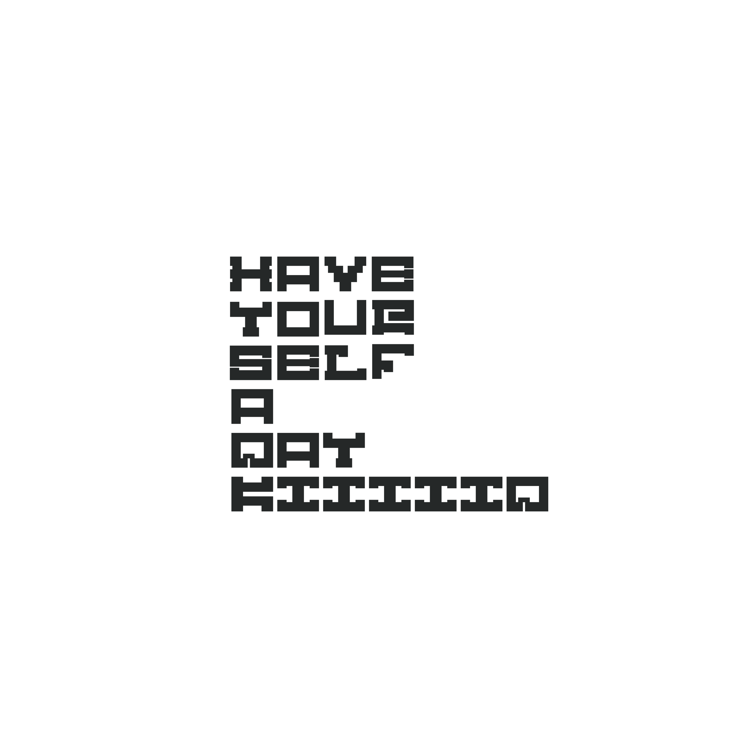
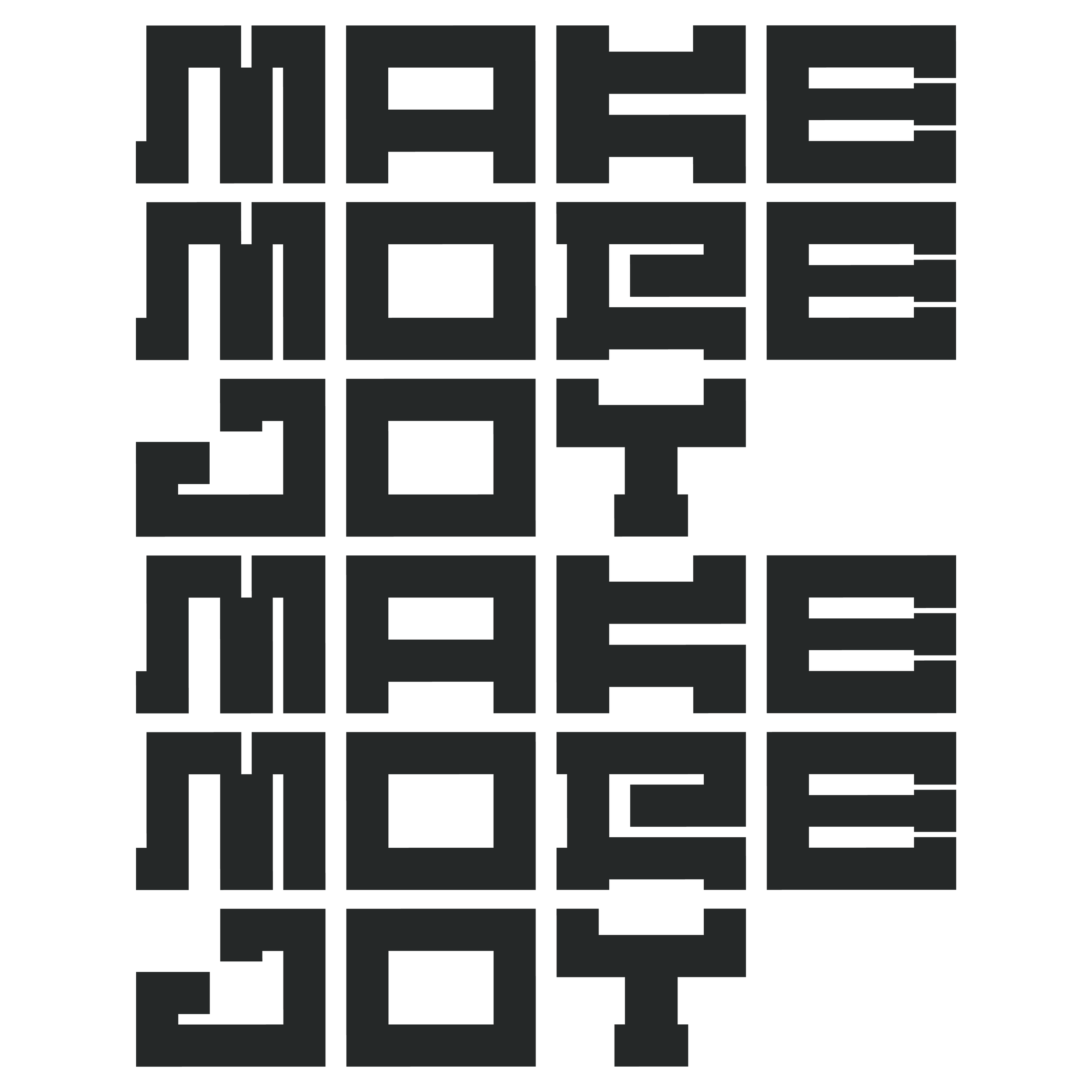
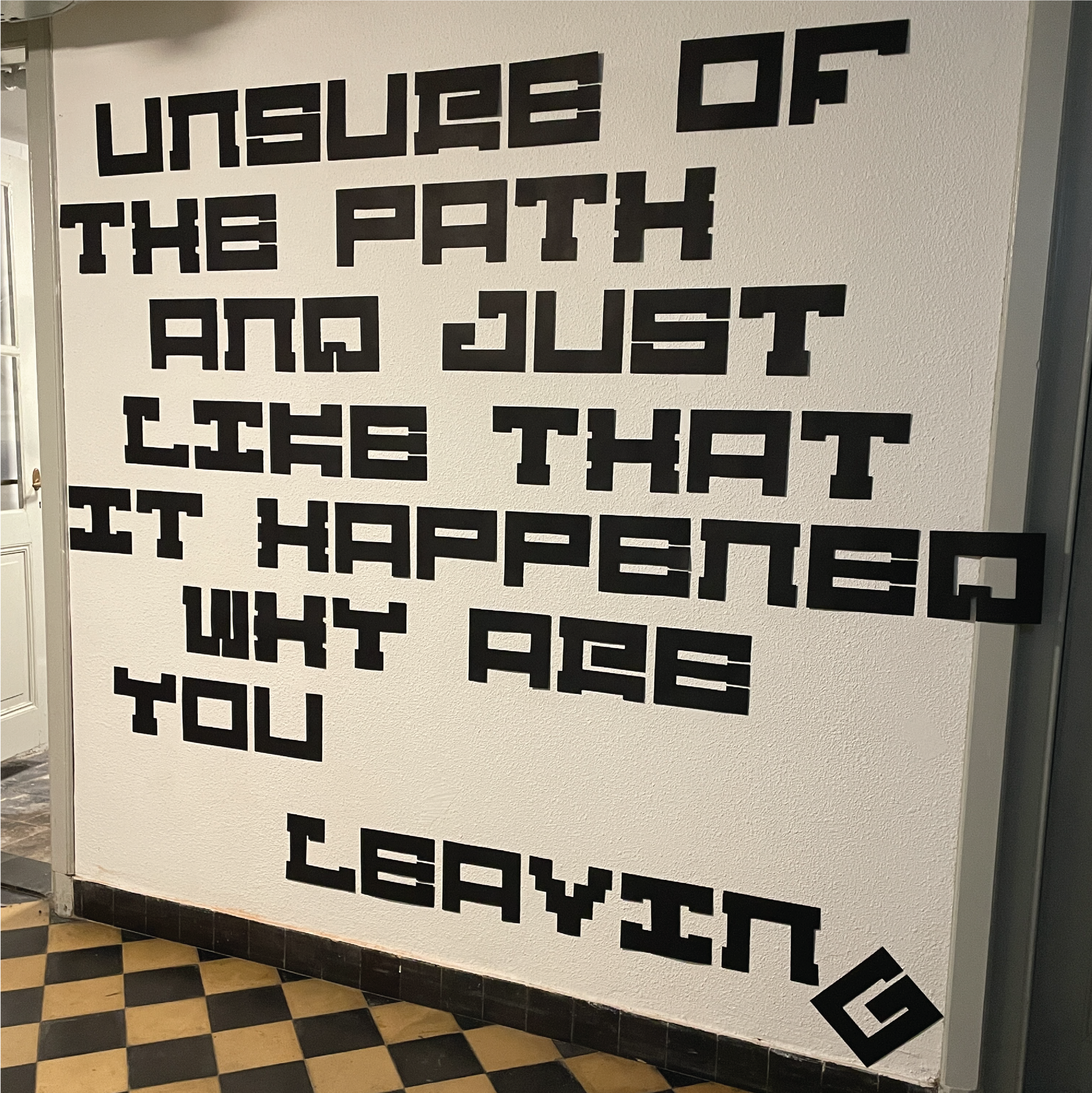
I had the opportunity to utilise my Benchmark lettering system in highlighting the work of Sy Woolstenhulme, whom I am lucky enough to call a dear fried. Originally from Utah, our paths crossed in Boston, Massachusetts as design apprentices at Reebok. At the time, Sy was working in Color and Creative Design direction for the brand and I was under the Classics division as a apparel designer. Unbeknownst to me, Sy was and continues to be an avid writer in his free time. After a year together in Boston, I ended up moving to the Netherlands and during this time, he self published a book of his haikus. I immediately ordered a copy and would keep the book at my desk as work, ready from time to time during breaks. I knew i really wanted to see these on a larger scale outside of this wonderful book so I pitched Sy the idea of making his poems in large scale letters and posting them around my apartment. It was a challenge that we accepted, one picking the poems we thought were significant to both of us as well as agreeing on the look and feel. To be honest, I got very lucky, as Sy trusted my direction and gave me a lot of freedom in the curation of his works. I ended up cutting every individual letter by hand out of black paper and taping them up on the large walls of my studio apartment. The letters wrapping around corners, and crossing over hinges and door frames only added to the impact of the scale, transforming the room into a large scale book of sorts. I then went on to use the letters as a stencil in one case and did a mural out of chalk (that took forever, the wall was very rough and disintegrated my chalk on impact) on an exterior wall just outside the apartment. I think this project was impactful in my work ethic as it allowed me to be in a different state of making without judgement. With no formal training or constant guidance, I was able to take the design skillset I knew and interpret type and installation work as I seemed fit. I have felt as if this project really gave me a step up in my personal confidence in making and I’m happy with the results. A big thank you to Sy Woolstenhulme, a fantastic designer and wonderful friend, for allowing me a chance to push my self as a maker through your wonderful poetry. Please enjoy the photos below that document the work.


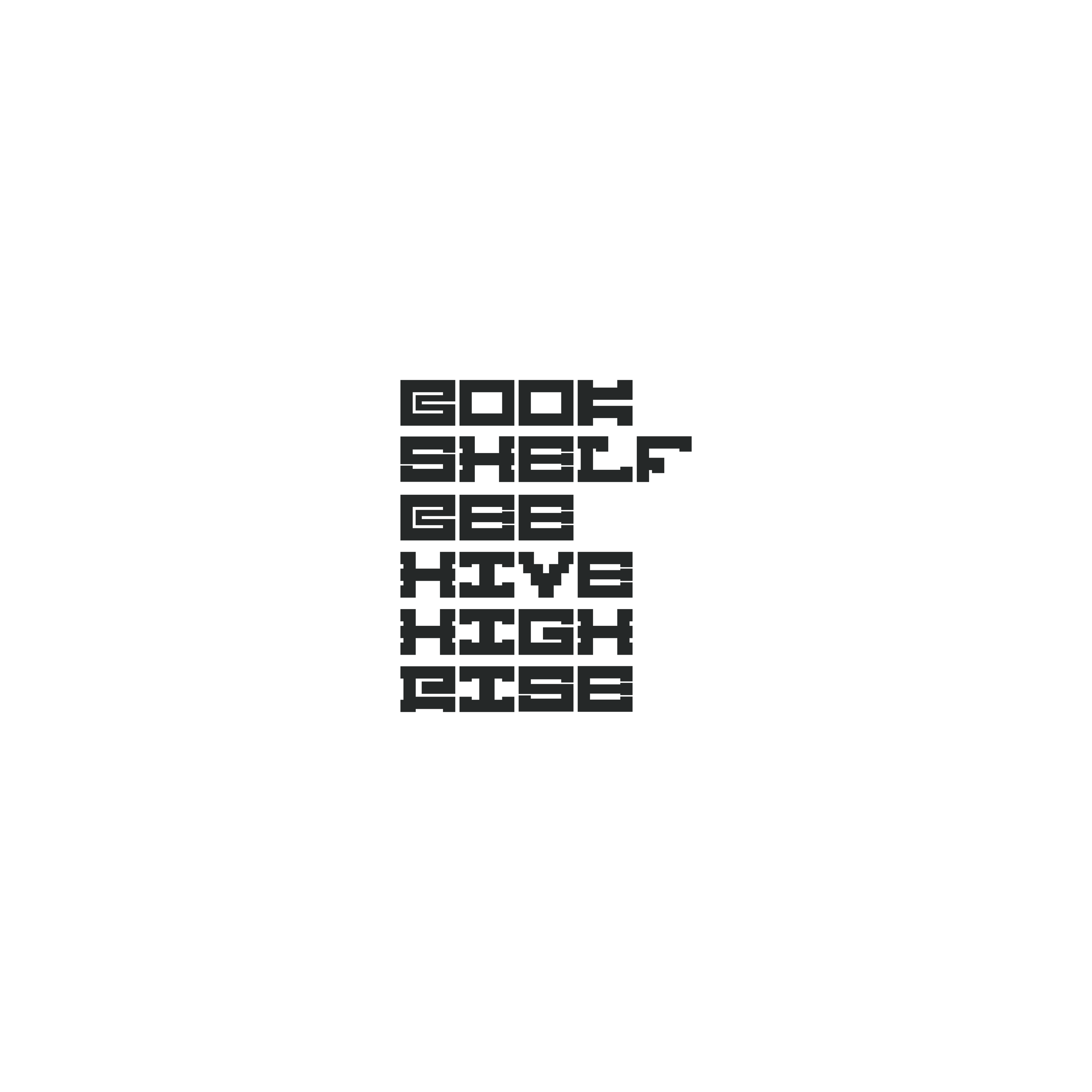
HARBOR: The Future of The Library and Personal Research Practices
Zealots of Stockholm (Free Information) plays in the background…
ROOR.io / The Campus LA: Oakland AJ1 Low Special Edition Inaugural Class Graphics
While providing leather education in regards to footwear for the week long makers class, I was able to contribute graphic elements as well that embodied the class and the experience of the students. Original font was built as a commemorative class poster to highlight The Campus LA’s first Oakland workshop. The same graphic was then edited into a shirt graphic. Both the poster and the shirt cryptically display those involved in the inaugural class.


HOTSHOP 14 Font
Visual font explorations and final images for Hotshop 14, August 2021.


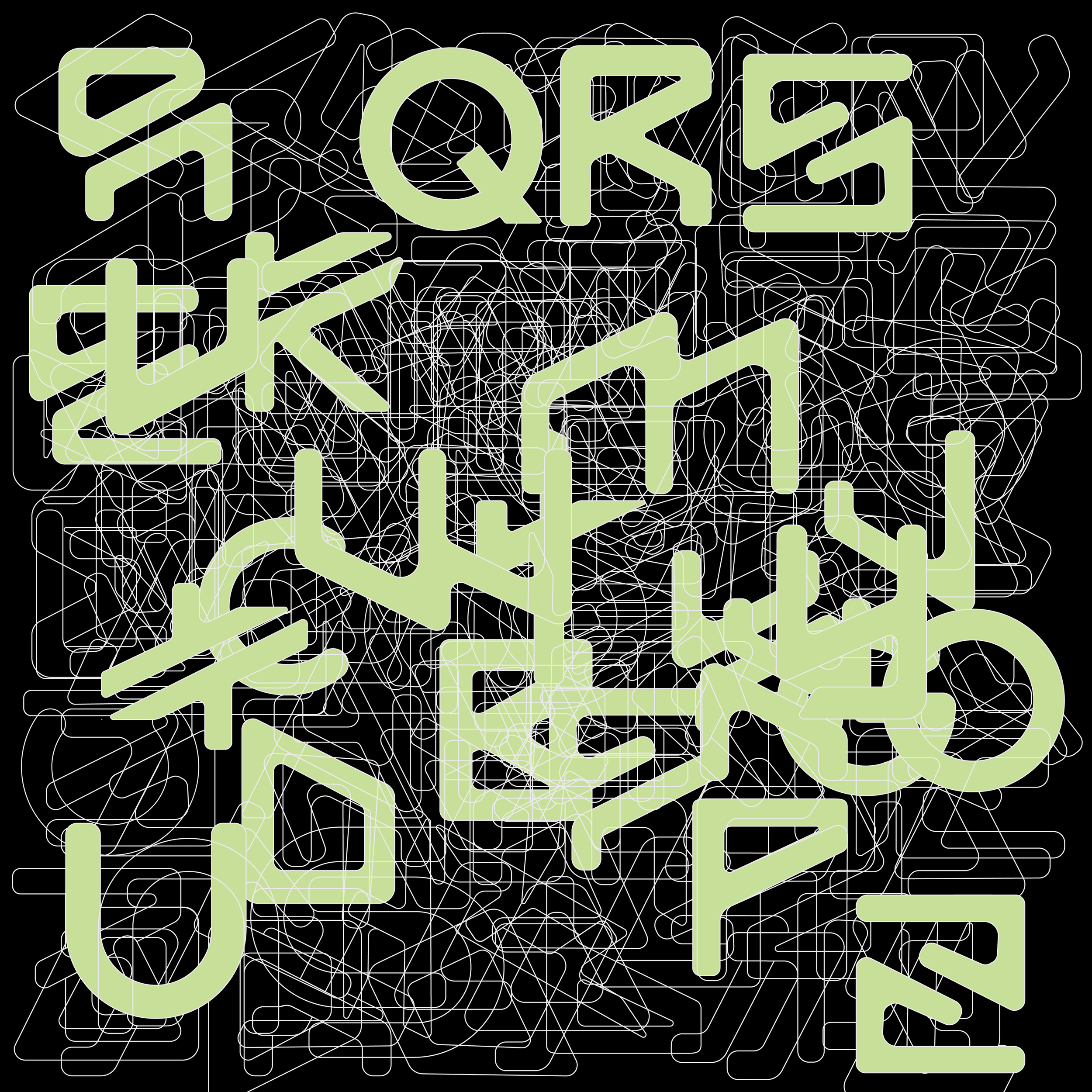
Base Alphabet (by Mirco Joao Pedro) with iteration overlays

Final Alphabet
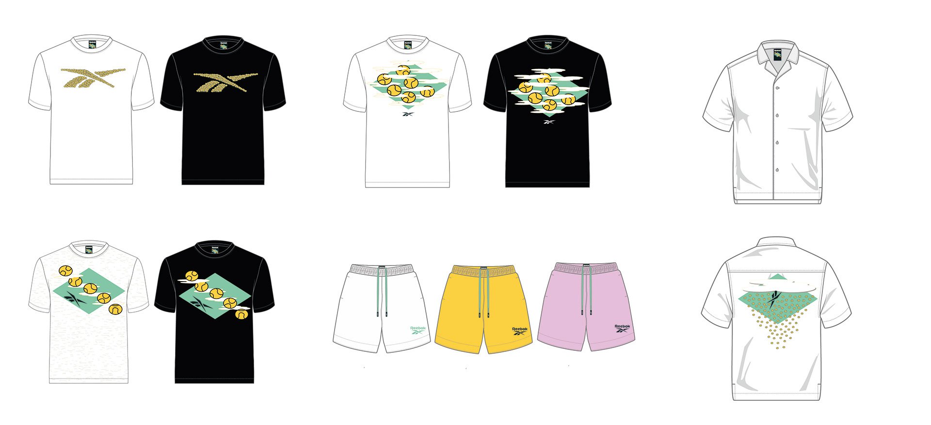
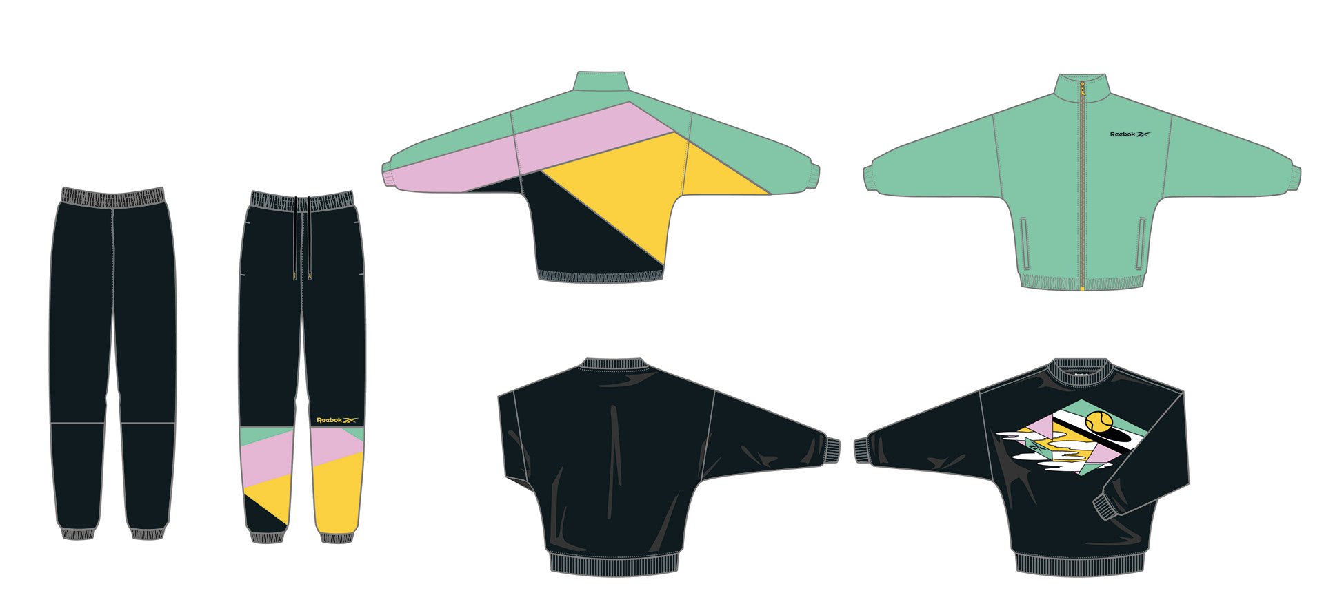
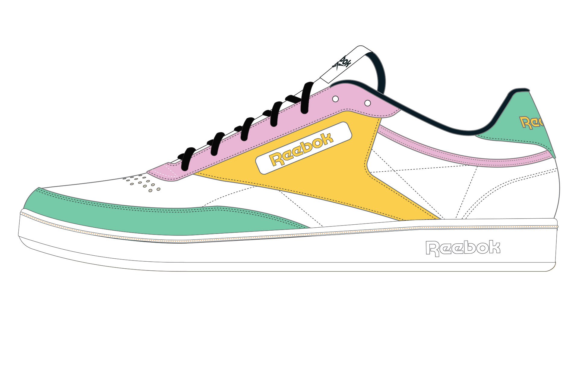
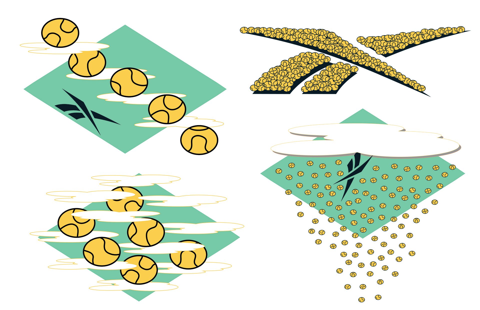
ECCO Upcycled Collection
A series of footwear silhouettes utilising deadstock leathers, a example of color / material play

![Hacks footwear mockup poster [Recovered]-01.png](https://images.squarespace-cdn.com/content/v1/617bb7bf30991c7912fbea0b/1639871875898-V5ZNHP499ERZTBFBYZBG/Hacks+footwear+mockup+poster+%5BRecovered%5D-01.png)
![Hacks footwear mockup poster [Recovered]-02.png](https://images.squarespace-cdn.com/content/v1/617bb7bf30991c7912fbea0b/1639871875998-89JU2ANFUSA36UQ07T64/Hacks+footwear+mockup+poster+%5BRecovered%5D-02.png)

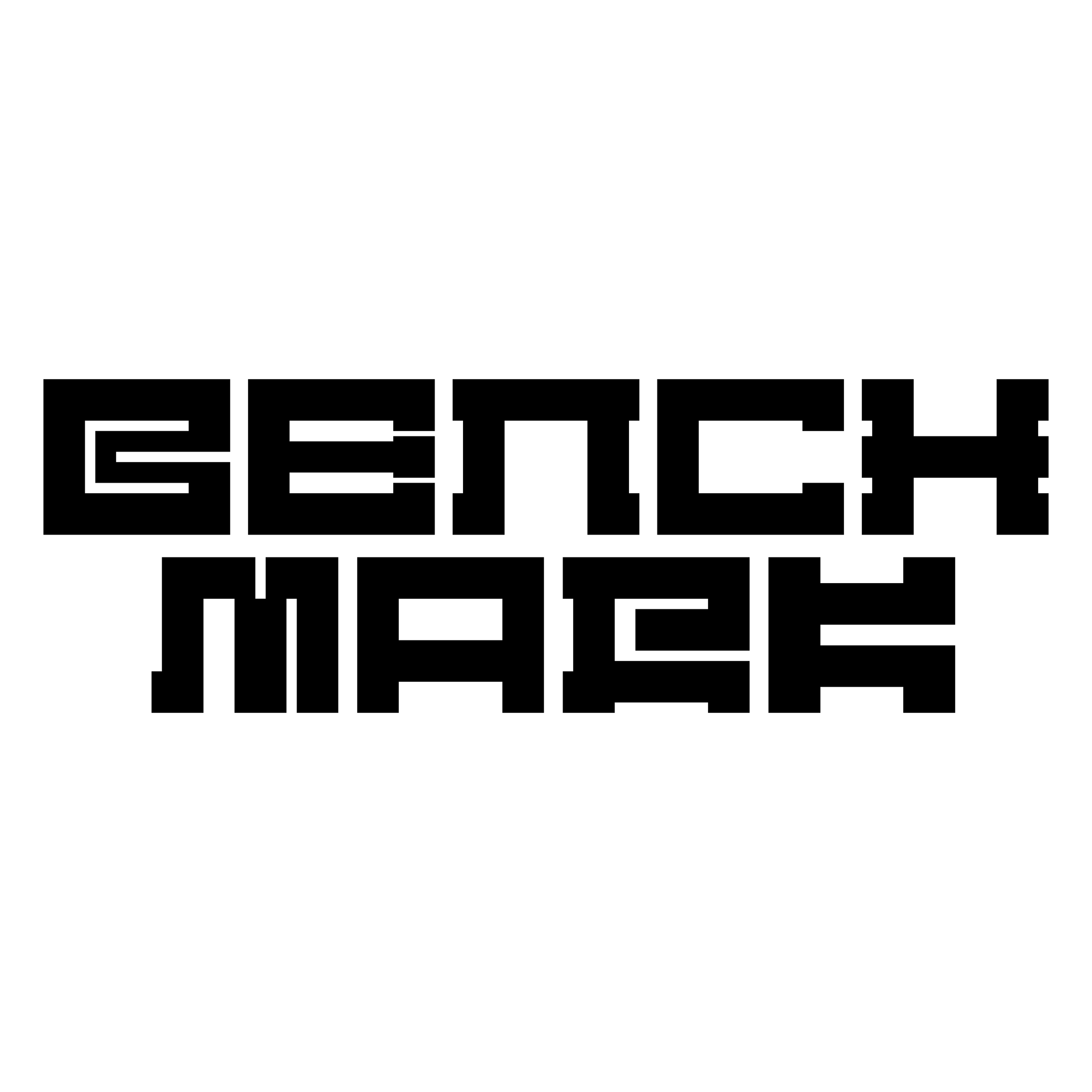
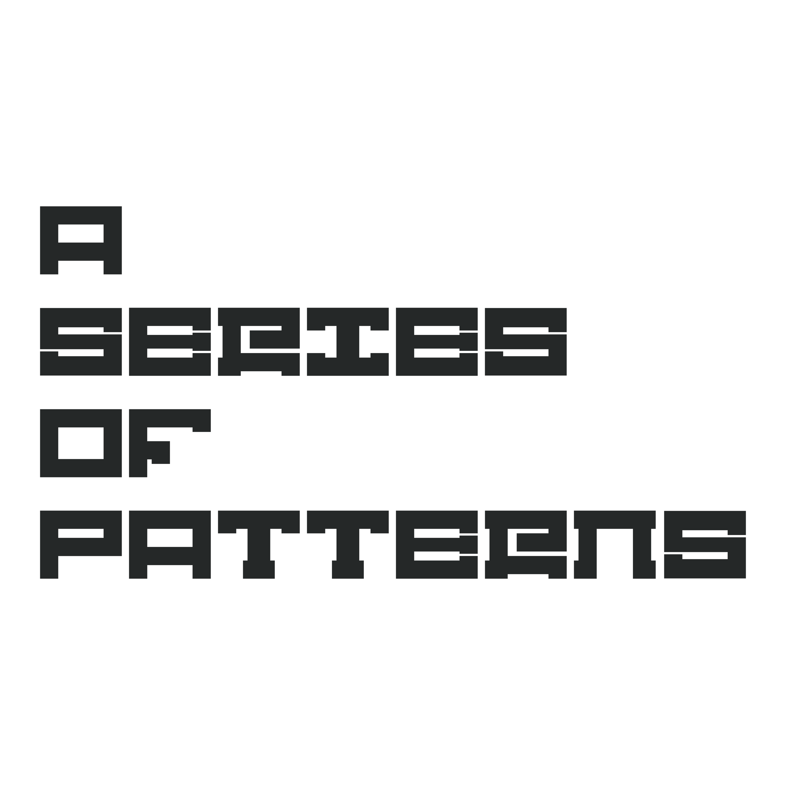
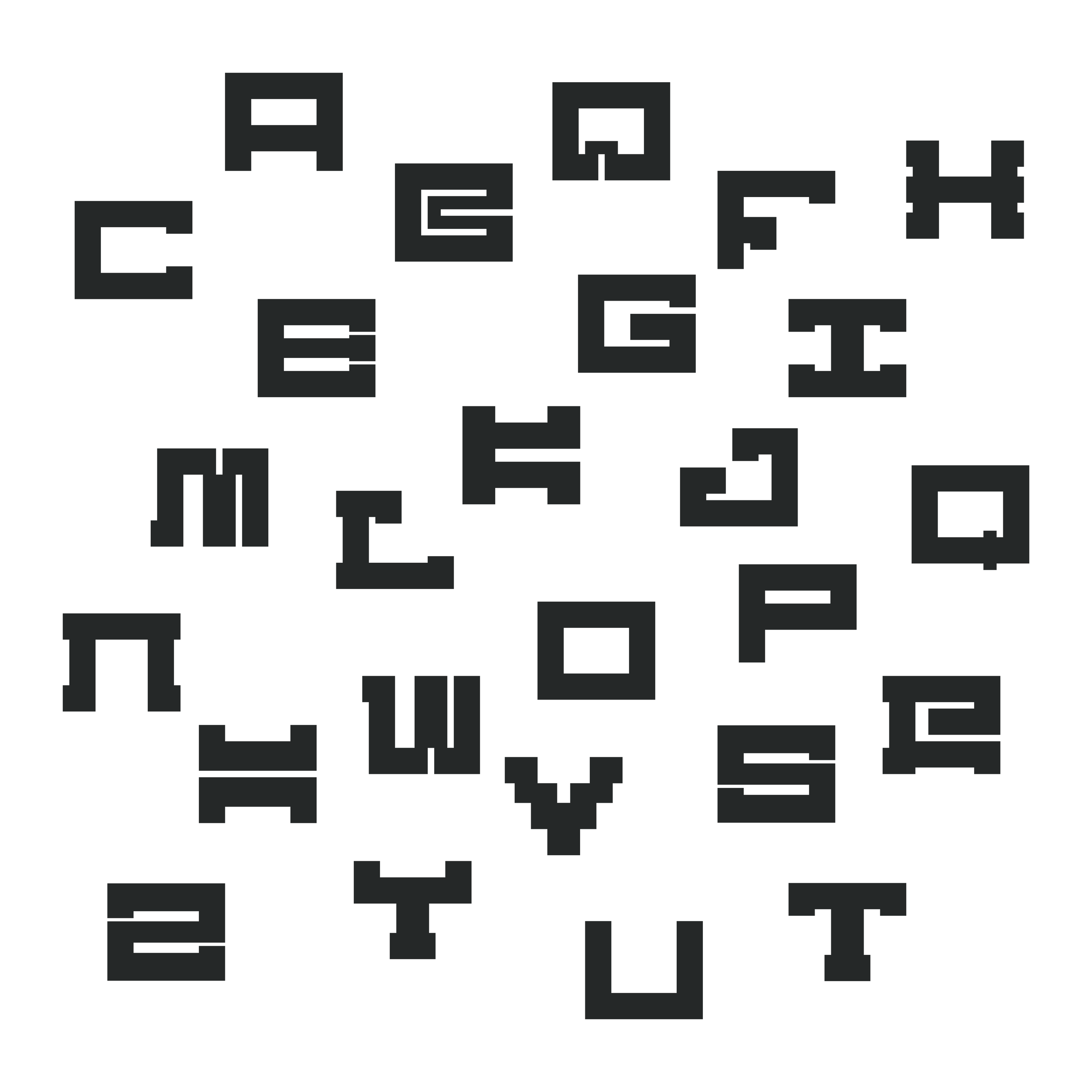
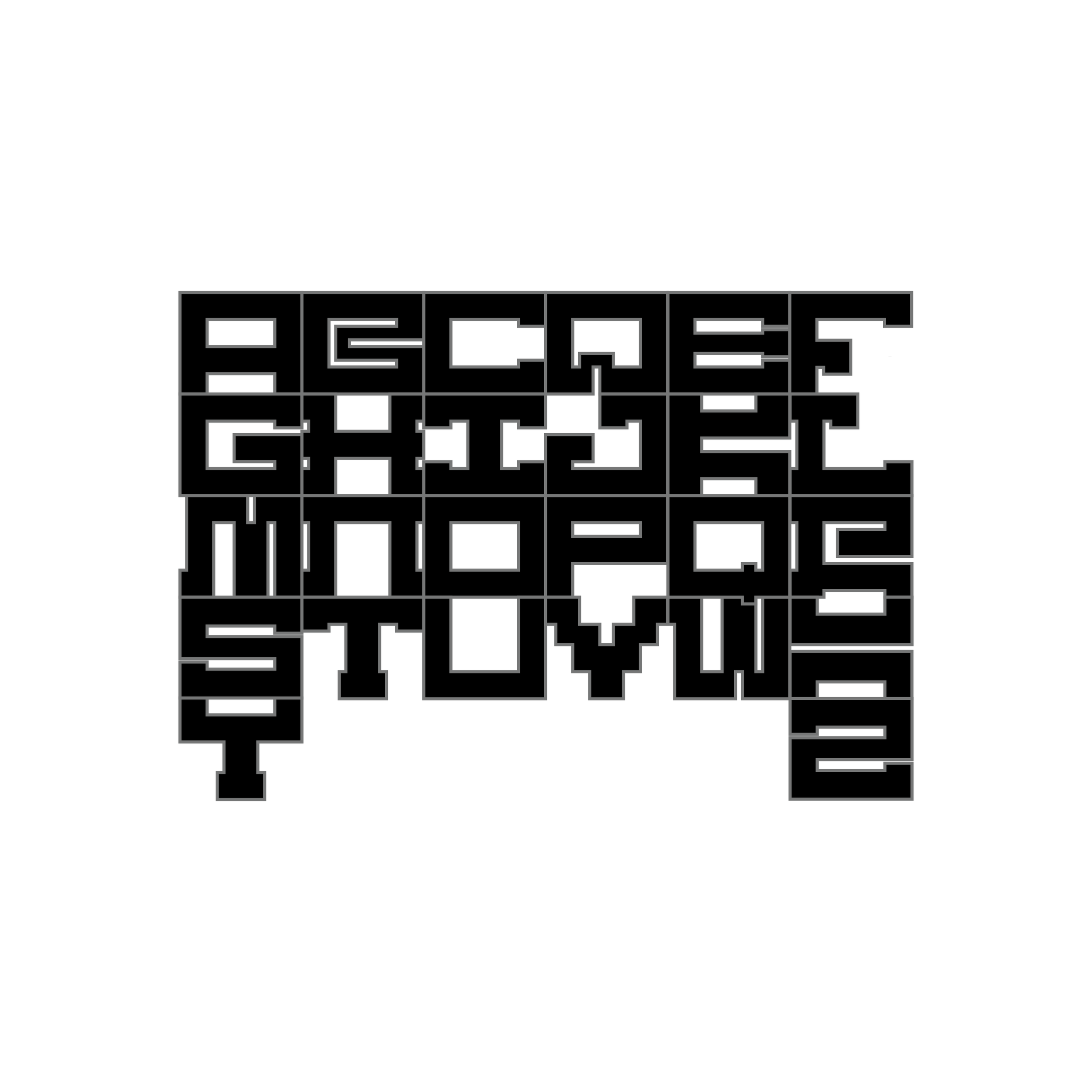
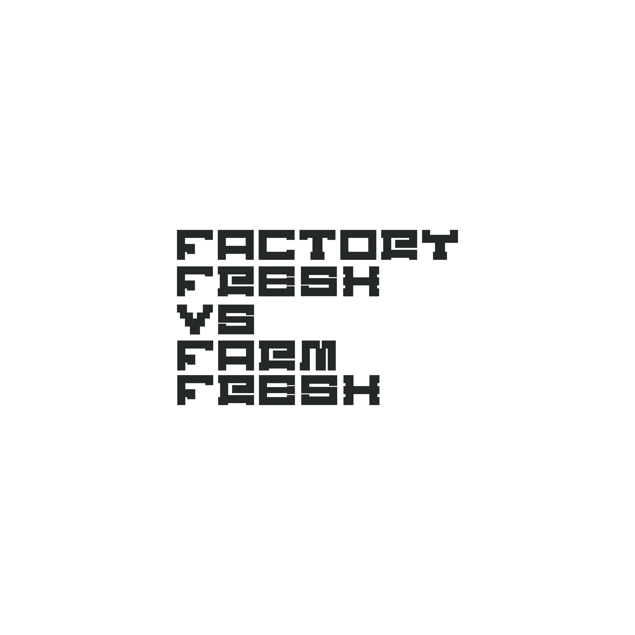
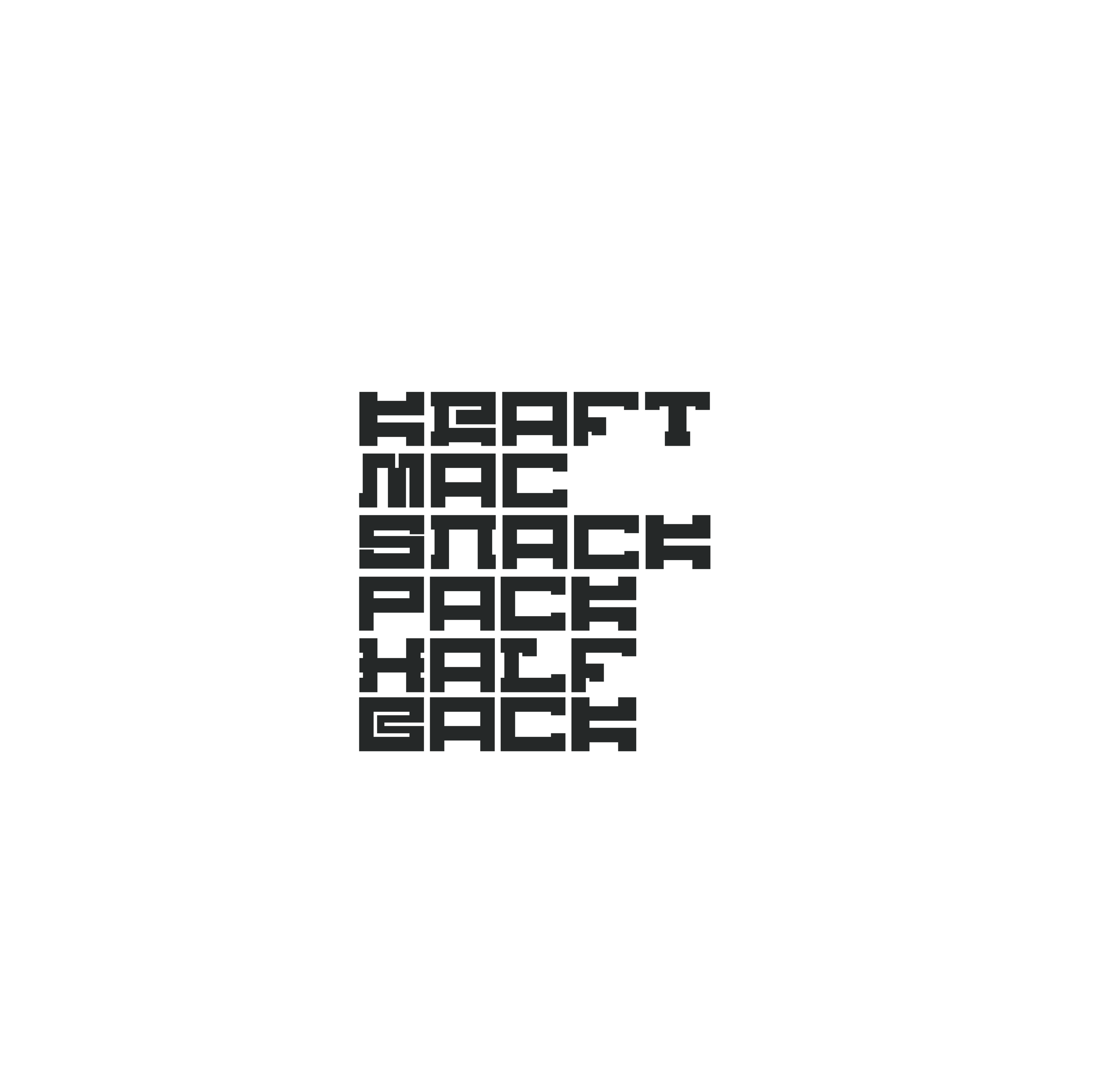
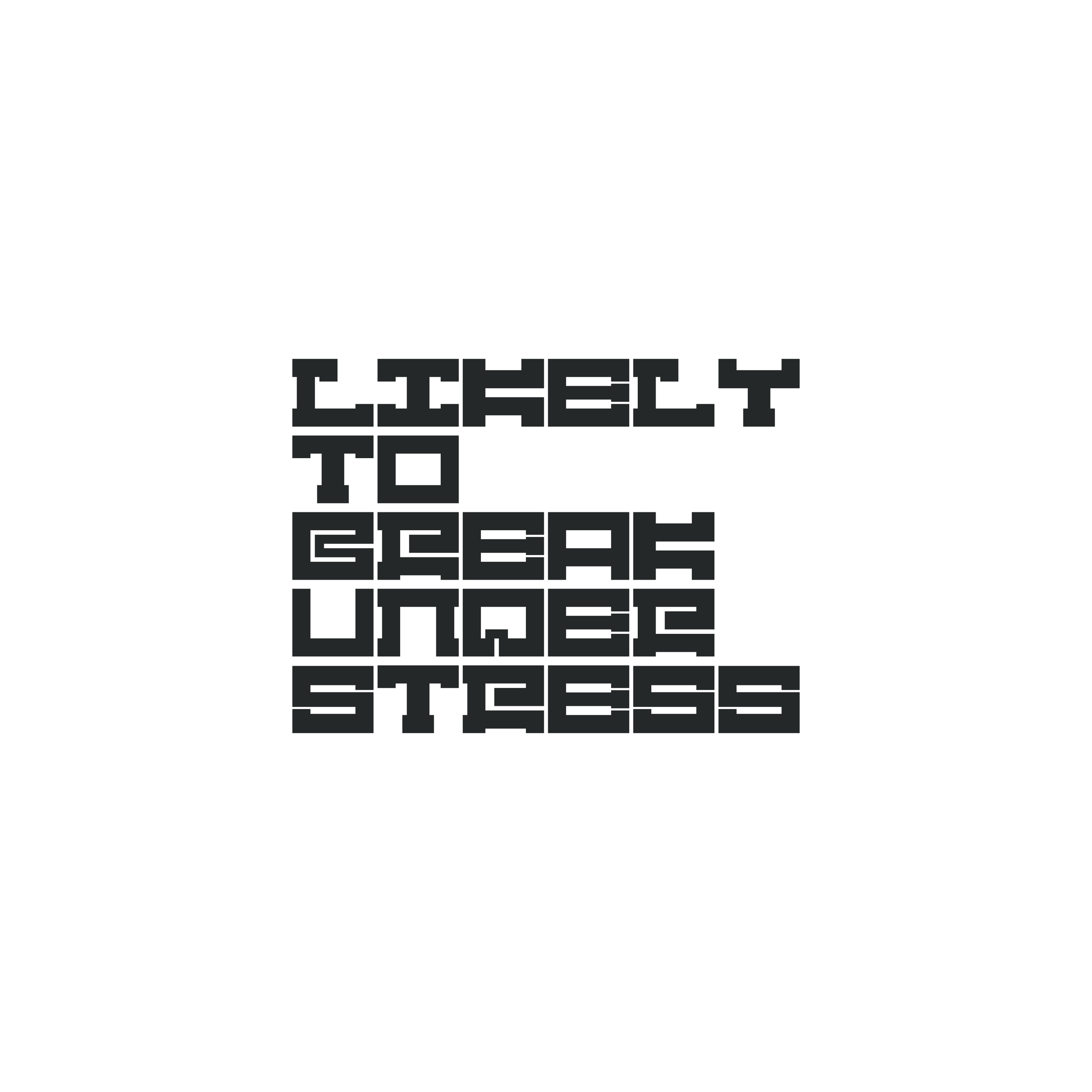
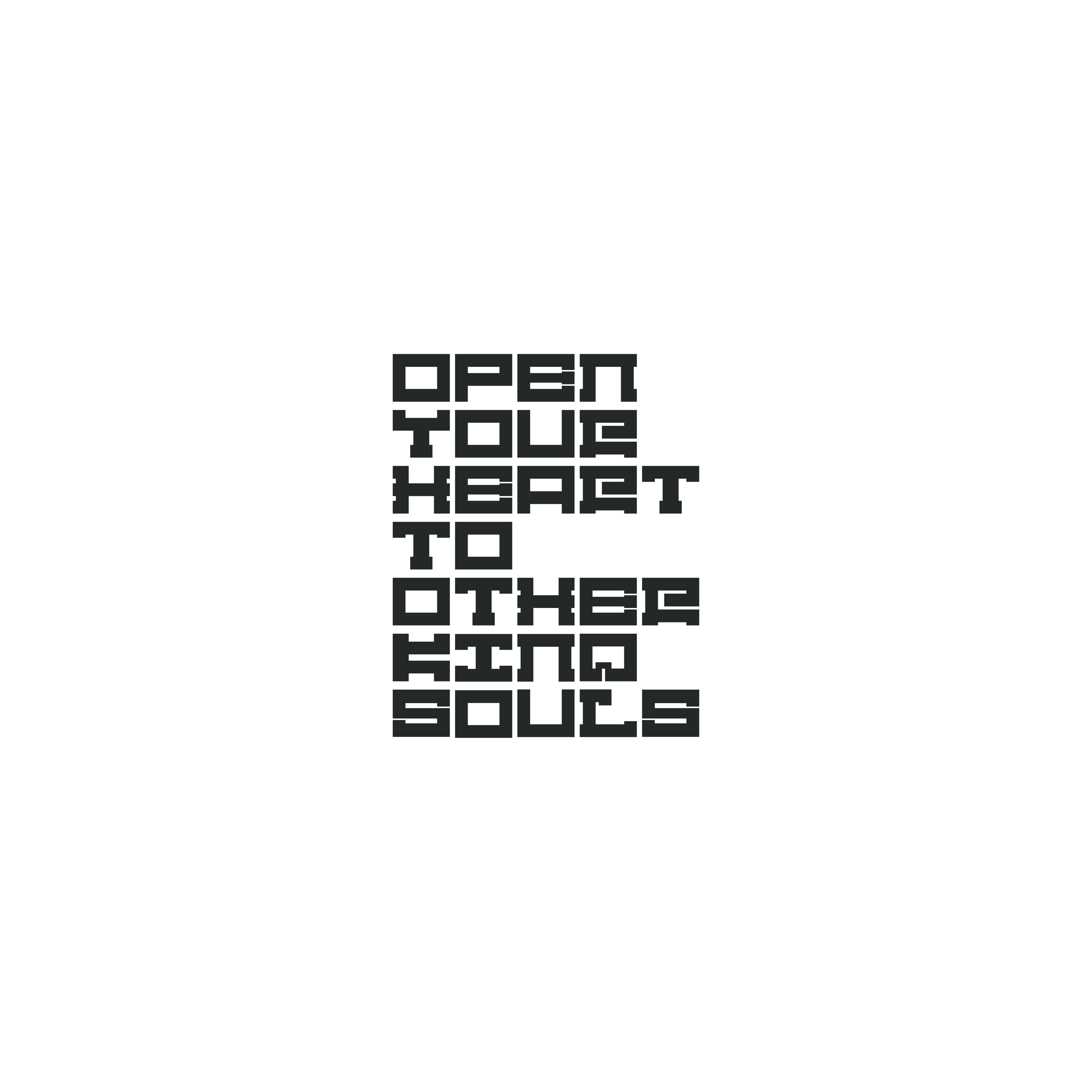
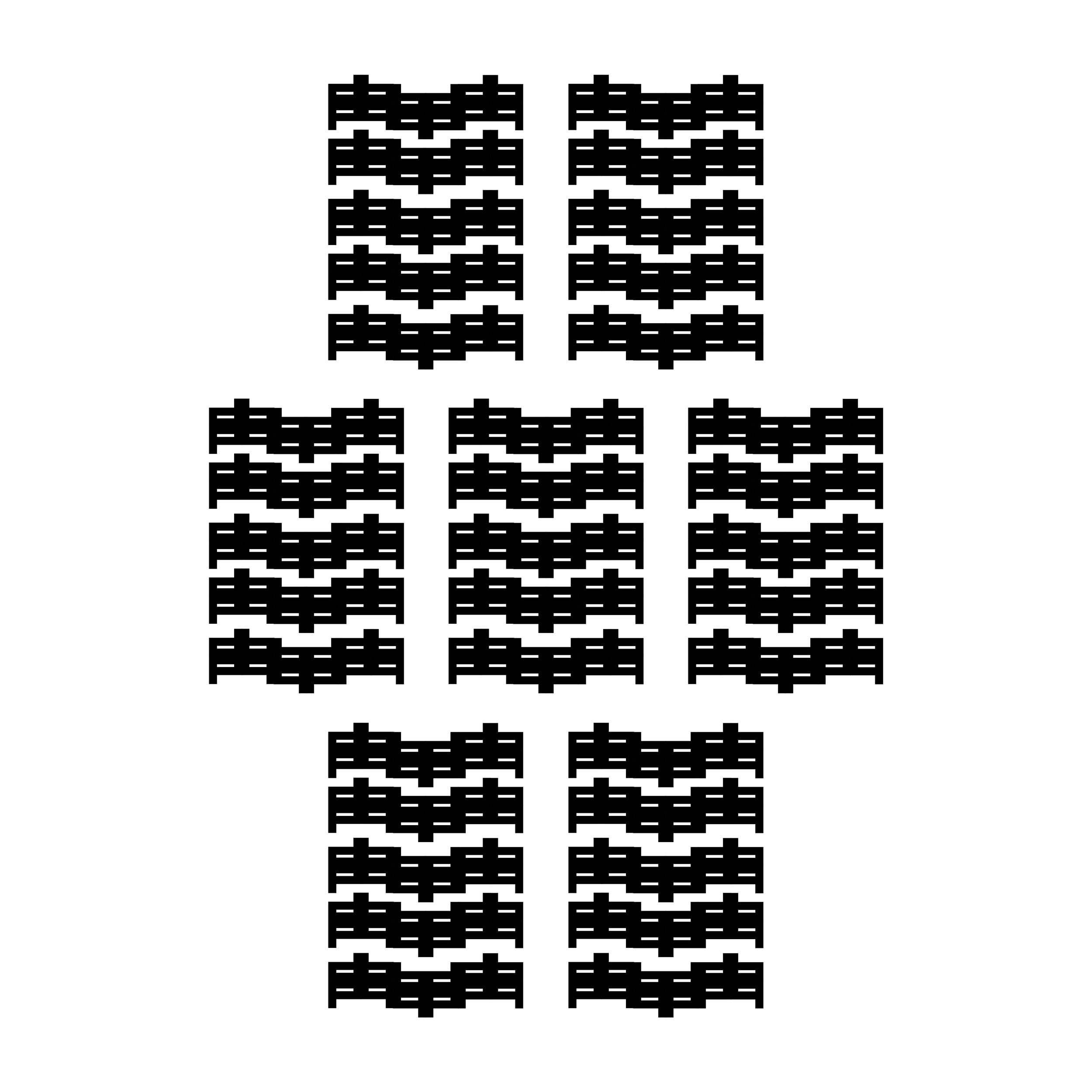
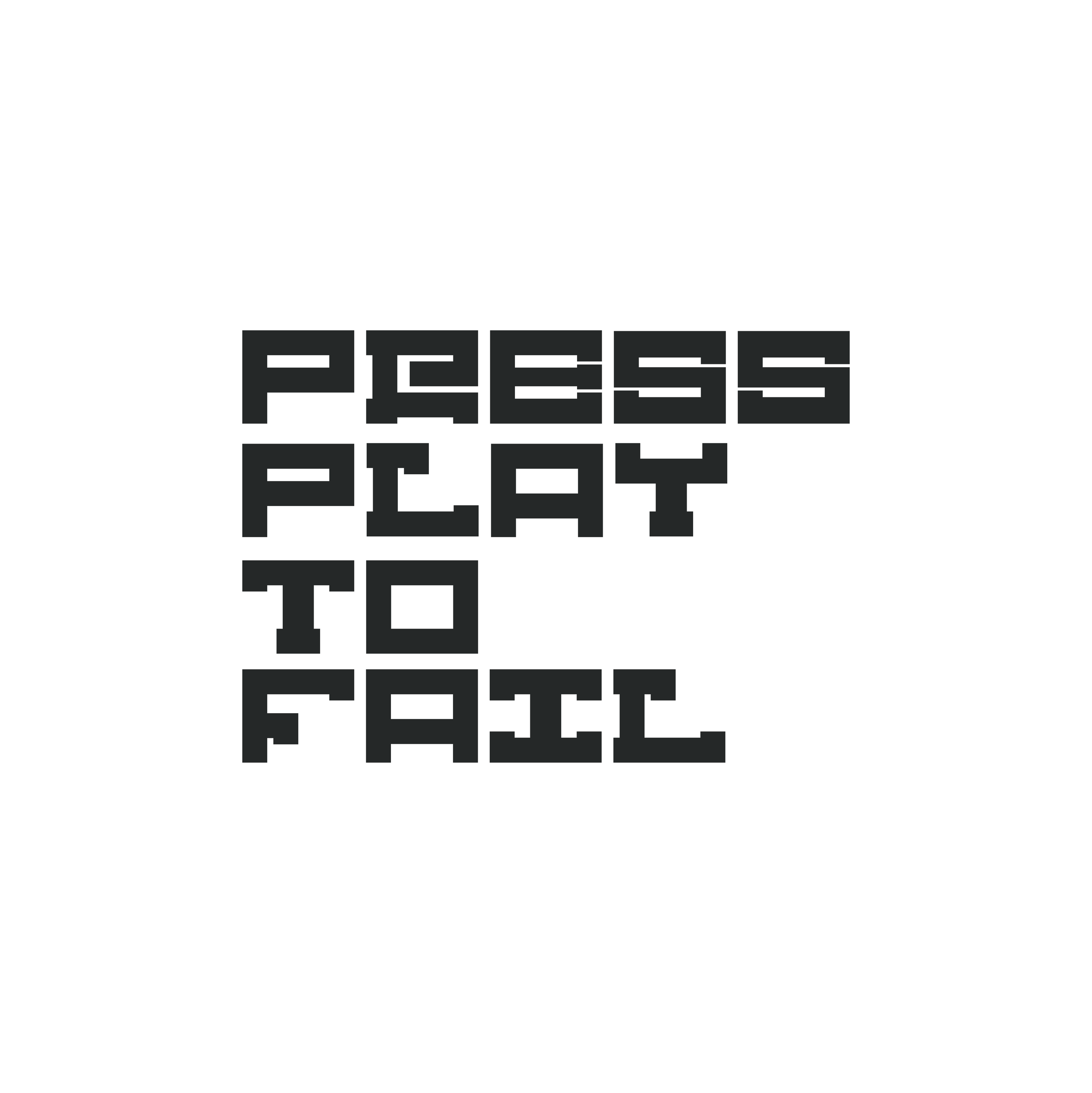
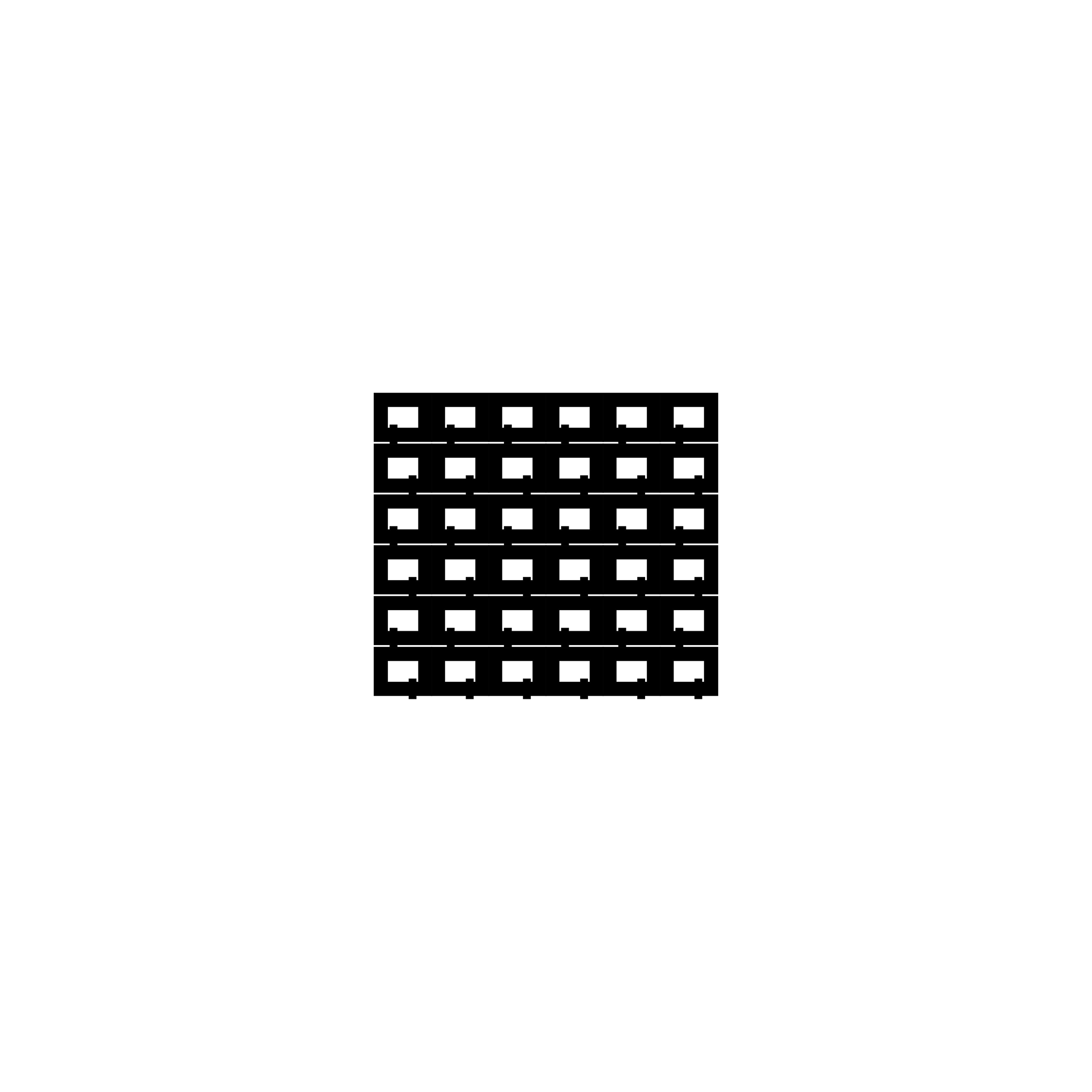
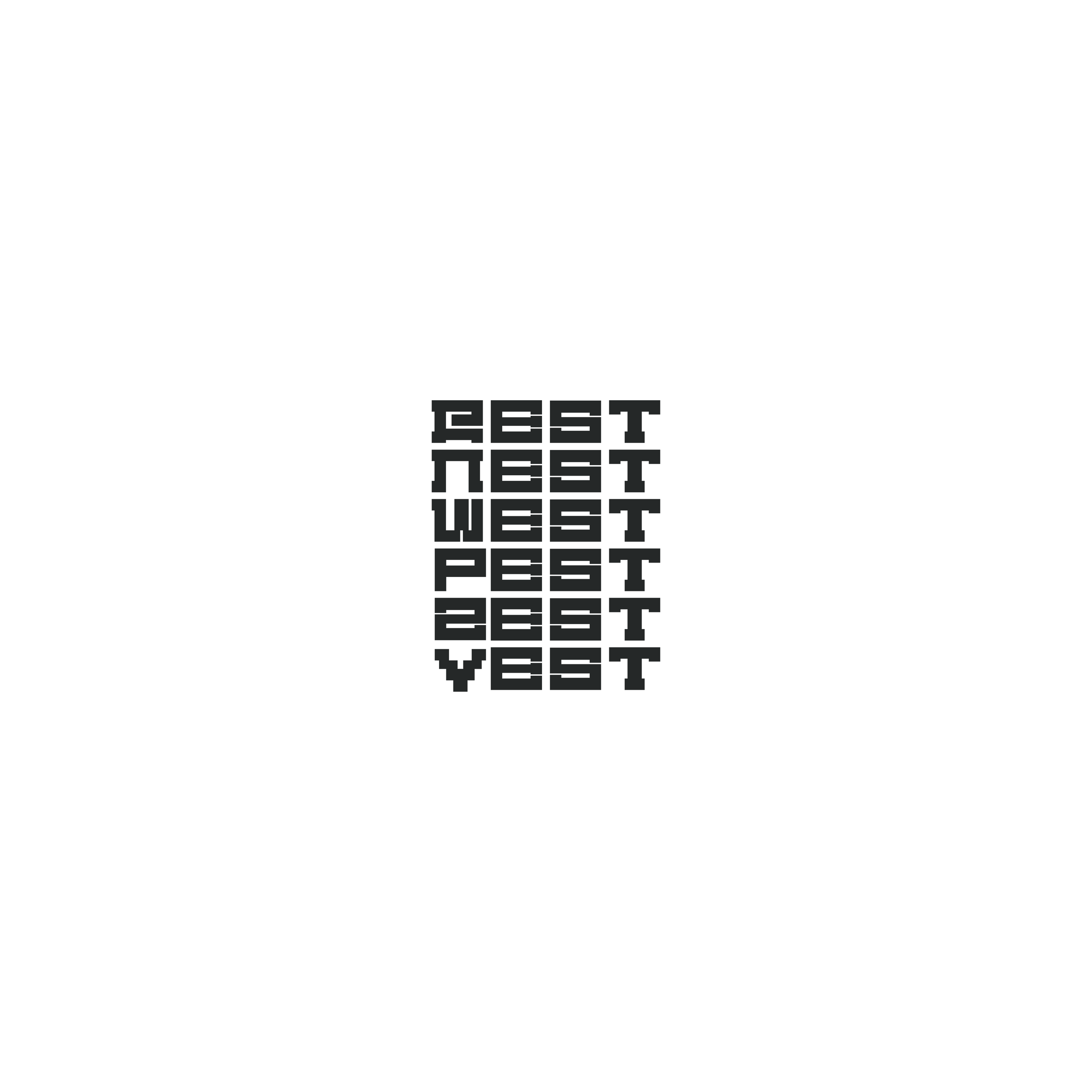
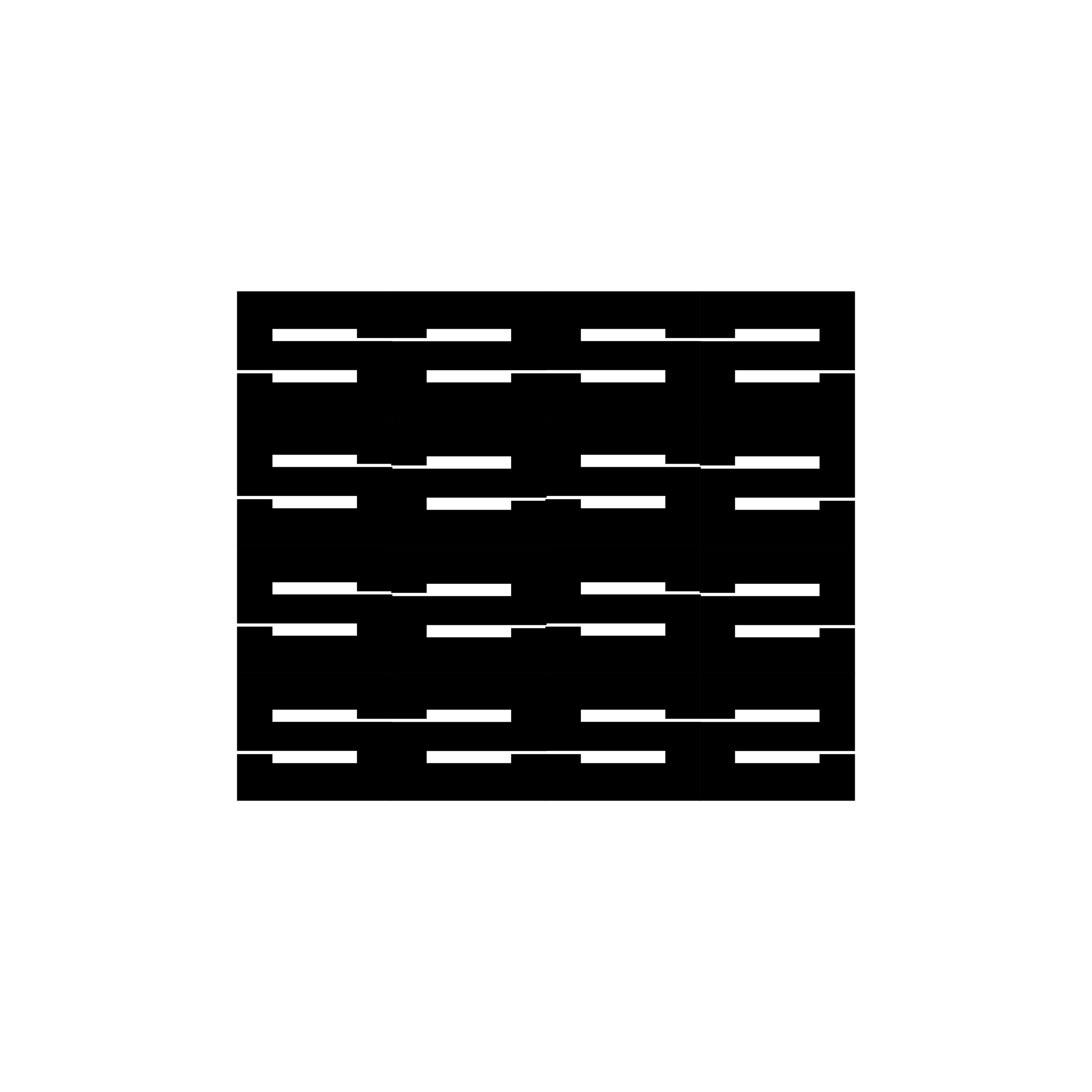
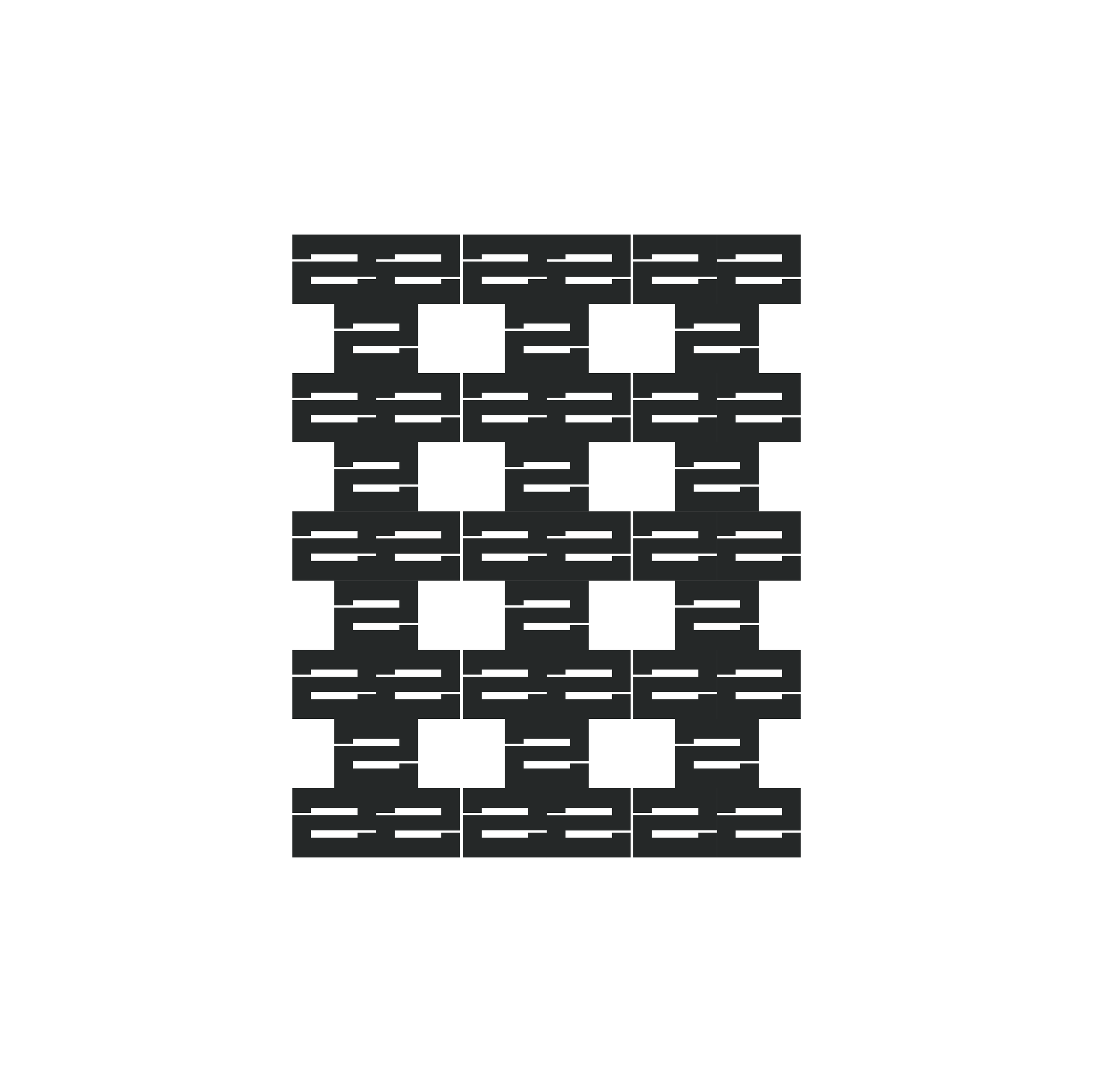
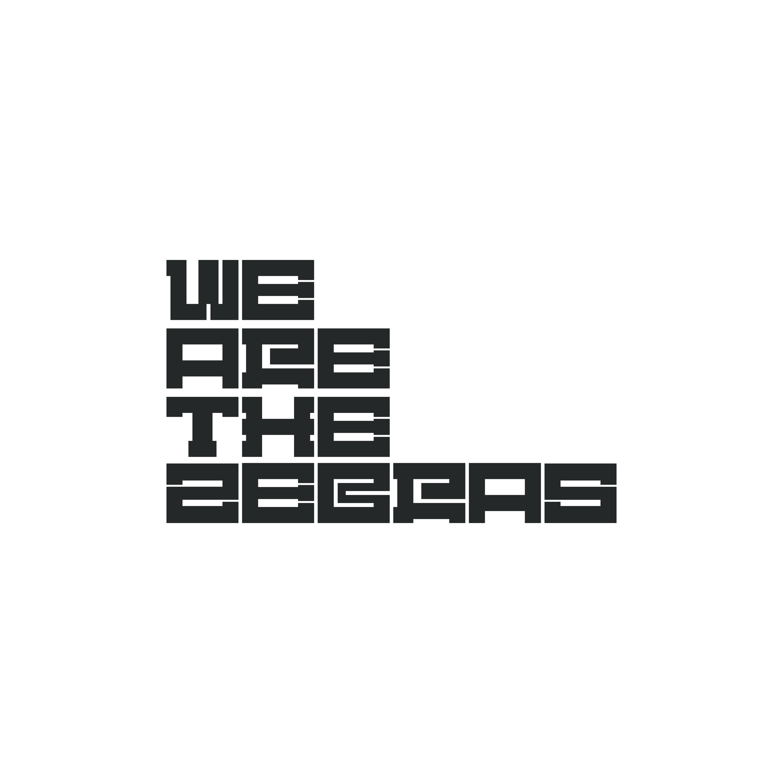
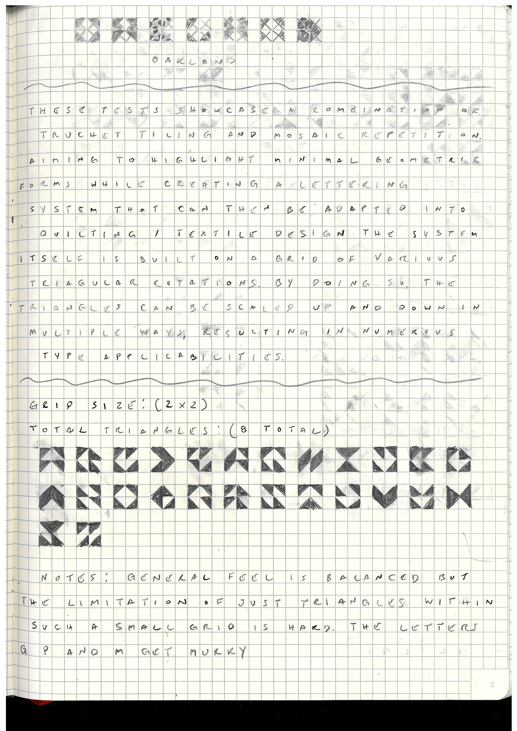
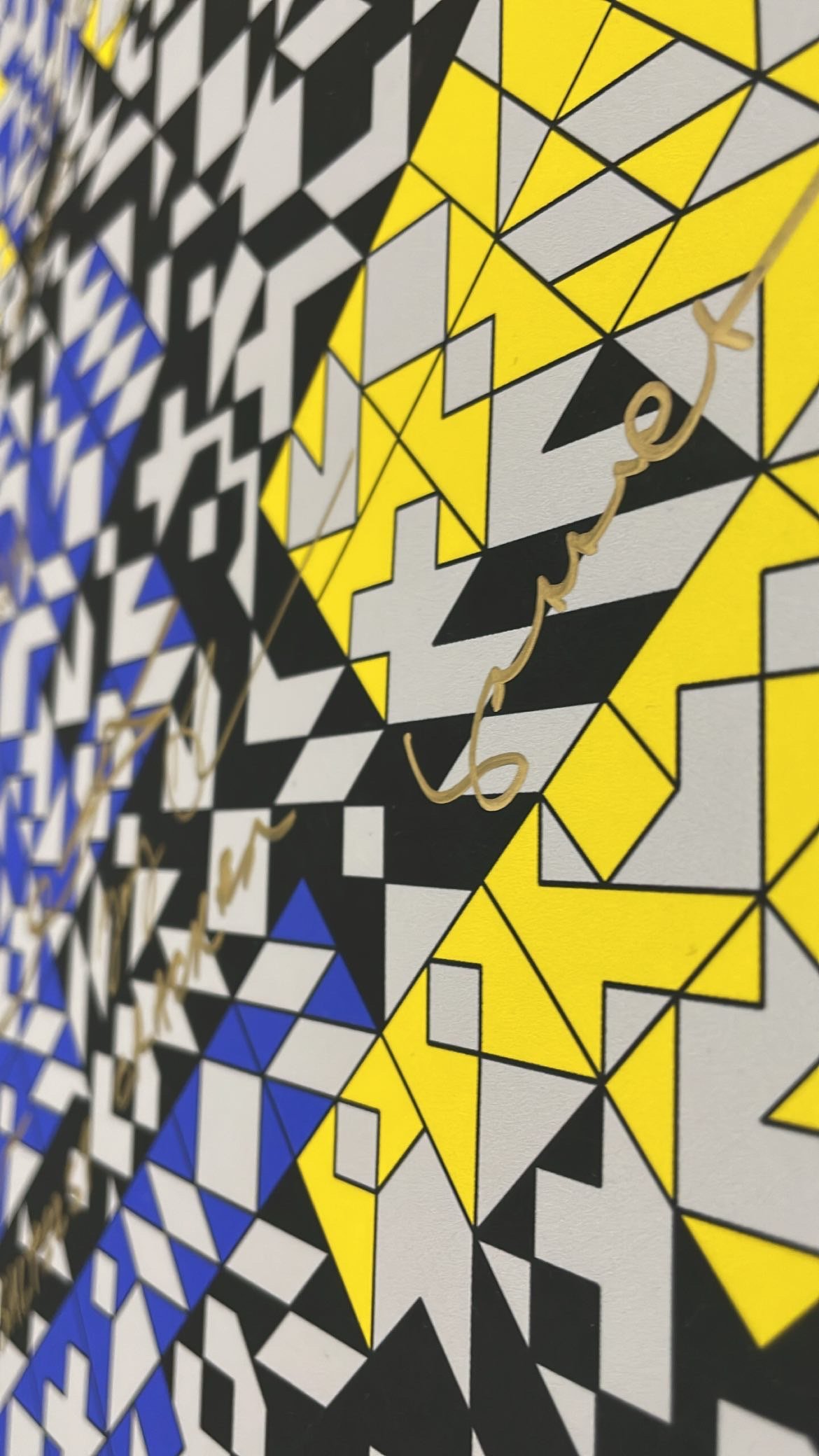
Benchmark: A Series of Patterns
Benchmark is a series of letters reinterpreted as a series of patterns, originally inspired by the bench I’ve had lunch on for the past year and a half…